The Method
This is a webpage that will contain a ton of random things i've learned about art...
Not complete yet! I want to add more stuff but I'll probably forget.
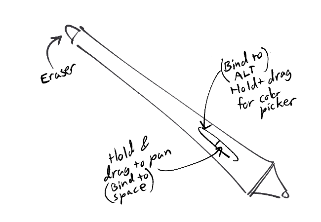
Keyboard/Pen Shortcuts
I use a Wacom tablet and CSP on Windows, but any time I use some other art software, I bind these shortcuts:
- Ctrl+Z - Undo
- Shift+Ctrl+Z - Redo
- A and L - Lasso/Freehand select (A for lasso might sound unintuitive, but it's right next to Ctrl+Z which I find convenient)
- M - Rectangle select (It's called "Marquee" sometimes)
- V - Move/transform
- G - Fill tool/Gradient
- Ctrl while Dragging - Move layer
- Alt while Dragging - Eyedropper
- Alt + [/] - Go down/up a layer
- [/] - Decrease/increase brush size
- Tab - Hide everything except for the canvas.
- R while dragging - Rotate view
- Space while dragging - Pan view
- Del - Clear layer
And here are my pen buttons:
Clean Sketching
A good sketch should be clean so that it's lineart-ready, and you're not anxiously guessing each line while doing lineart.
The way I keep my sketches clean is by starting at low opacity (draw lightly with an opacity brush), then increasing the hardness or layering lines as I get more confident (effectively "confirming" the lines I want to draw).
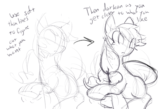
It's fairly messy, obviously (it's a sketch after all) but you can see how the earlier attempts are "faded out", and how the finalized sketch takes center stage. This virtually eliminates the need to do multiple sketch layers and such.
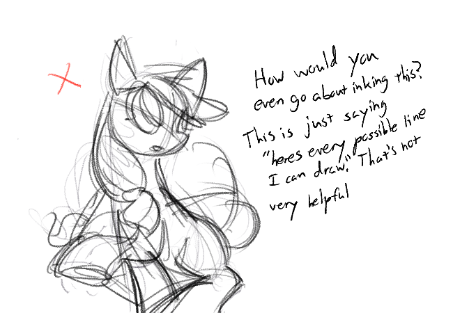
Here's an example of the opposite case:
Clean lineart
There's a lot of things that contribute to clean or messy lineart... first things first:
Seriously!! Your line should take up a third of your screen at most. You don't need to zoom all the way in. Clean lineart isn't just "line smoothness", it's also good lines. Good lines work with every other line, they're a part of a larger whole. They serve a clear purpose, and look coherent with everything else. How do you expect to do any of these if you're all the way zoomed in and can only see 1 line at a time! Zoom out. Please.
Also turn off stabilizer!! or at least set it really low. I know it sounds counterintuitive, but getting solid lines is easier when the software isn't damping your movement like crazy.
Now that your stabilizer is turned off, I implore you to start drawing from your elbow/shoulder. It gives you a much wider degree of movement, and after a bit of practice your lines will become a lot smoother naturally.
(You can still draw with your wrist sometimes, but limit it to small details or hatching.)
Finally, you should be spending at most 0.5-1.5 seconds on each line
With all that in mind here's how to lineart. I'm gonna ink the sketch from before.
The first thing we want to do is pick a line to draw, and analyze it.
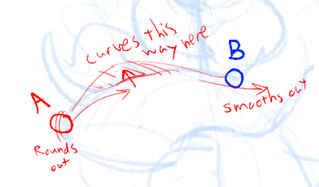
Where does the line start and end? Which direction does it bend, and where? What is it for?
When you've assessed the line, put your pen on point A, and move it with your arm to B at a steady pace. For the curve, imagine your arm being slightly "pulled" by the curve direction, like a gravitational force.
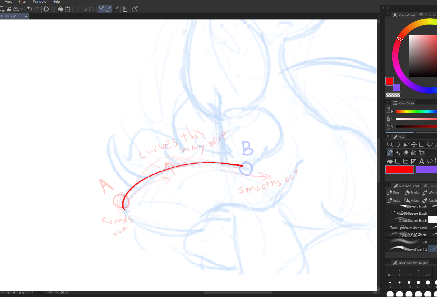
This line is kind of off... it doesn't bend in the way I intended.
So I'll undo it. There's nothing wrong with that.
And I draw it again, and again, until it's the way I want. Don't be afraid to undo a lot! I usually limit myself to 8 undos for the sake of time.
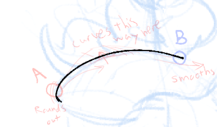
That's better.
It's also important to gauge whether you should pull or push the line away from you. Both work in different scenarios...
Also note that I didn't do 1 line for the whole hoof. I try to limit my lines to having 1-2 curves per brushstroke, so that it's more manageable.
Anyways, here are some more lines. I did these pretty quickly but whatever:
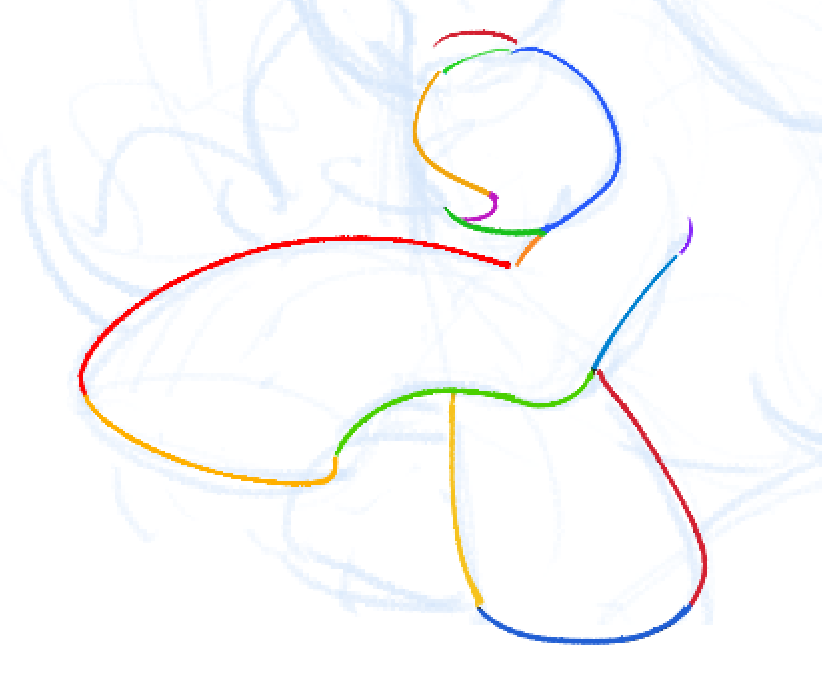
You don't need to obsess over making every single line "perfect". As long as most of the lines give off the correct impression and depiction of form you were originally going for, you have nothing to worry about. The lines you draw are more important than their smoothness or whether they intersect right.
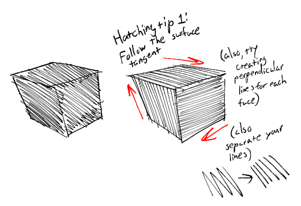
Hatching
I'm bringing up hatching because the way I hatch carries over well into how I paint, and it also contributes to good lineart.
A good reference point for hatching is to look at old engravings. Here's the Wikipedia image for "Engraving":
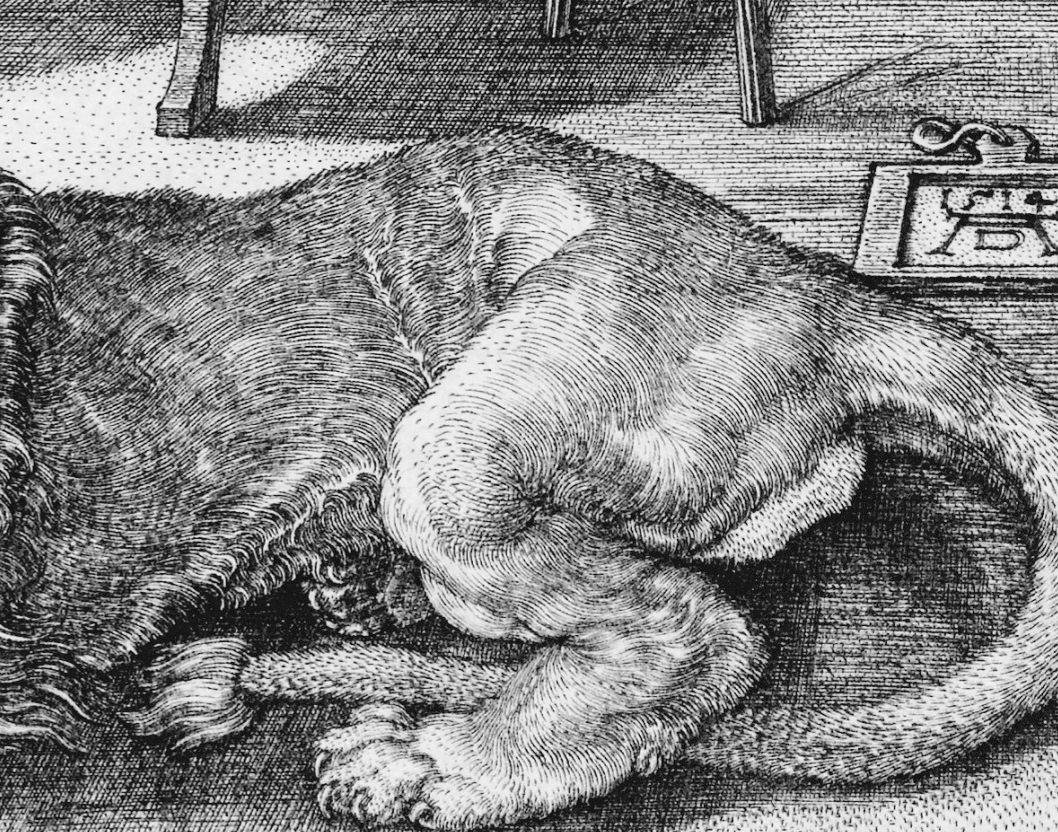
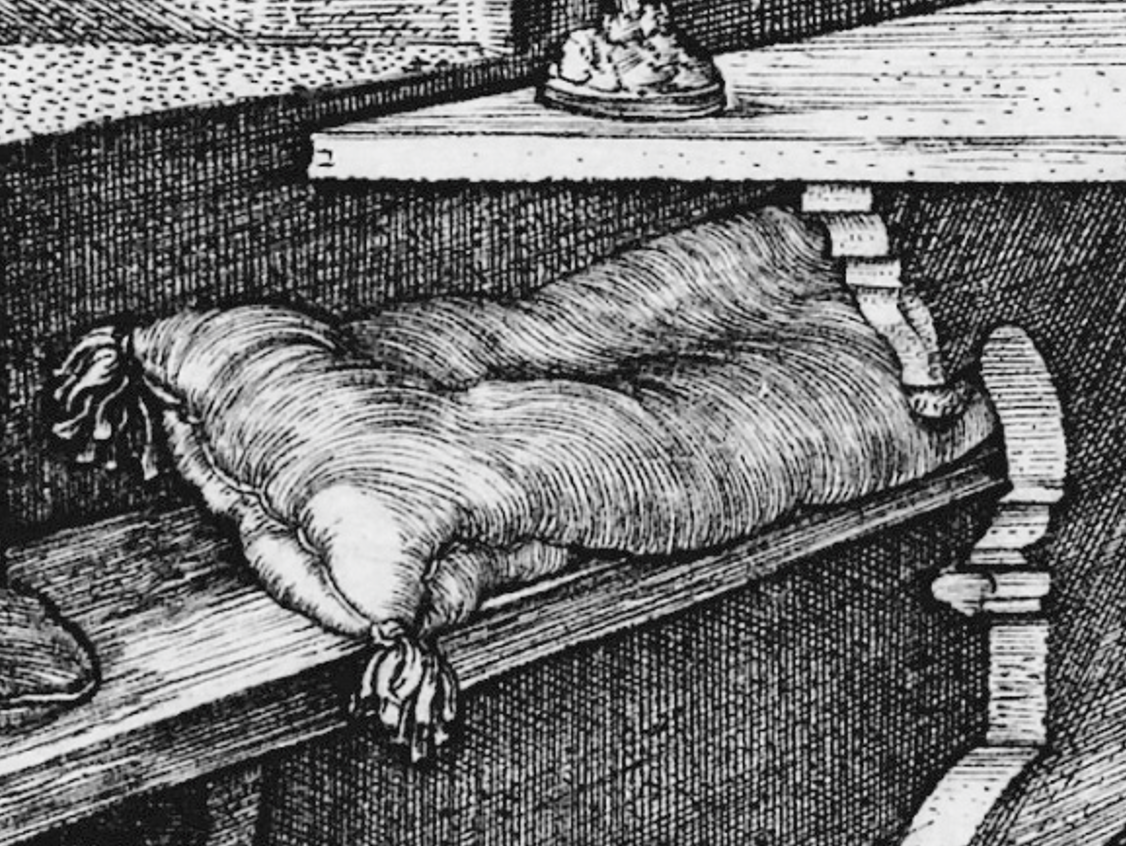
Notice a pattern? All the hatched lines look like they're "wrapped around" the object they're shading! This really helps sell the form + detail and provides a good framework for hatching.
Next, try to keep your hatching lines small. This will just give you more control, it'll look nicer, and its easier to undo. This is especially helpful for curved surfaces.
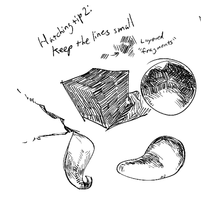
Finally, you'll want to keep your hatching to mainly 3 values. It's kind of hard to express this in words but basically the shading should be blown out to full white or full dark, and you can use midtones (partially hatched segments) to express detail.
Here's a hatched rock thing to show this (with a value blockout to show what I was thinking. The midtones are grey...):
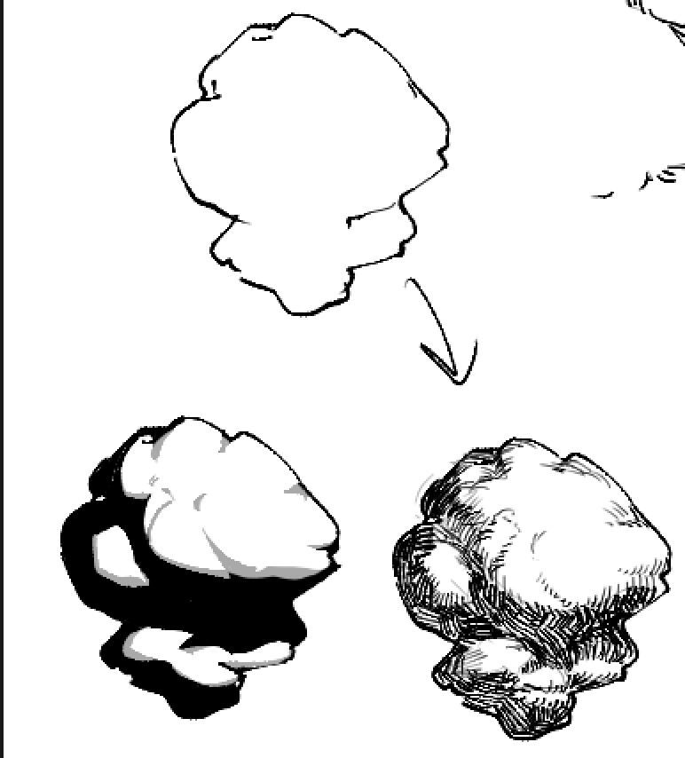
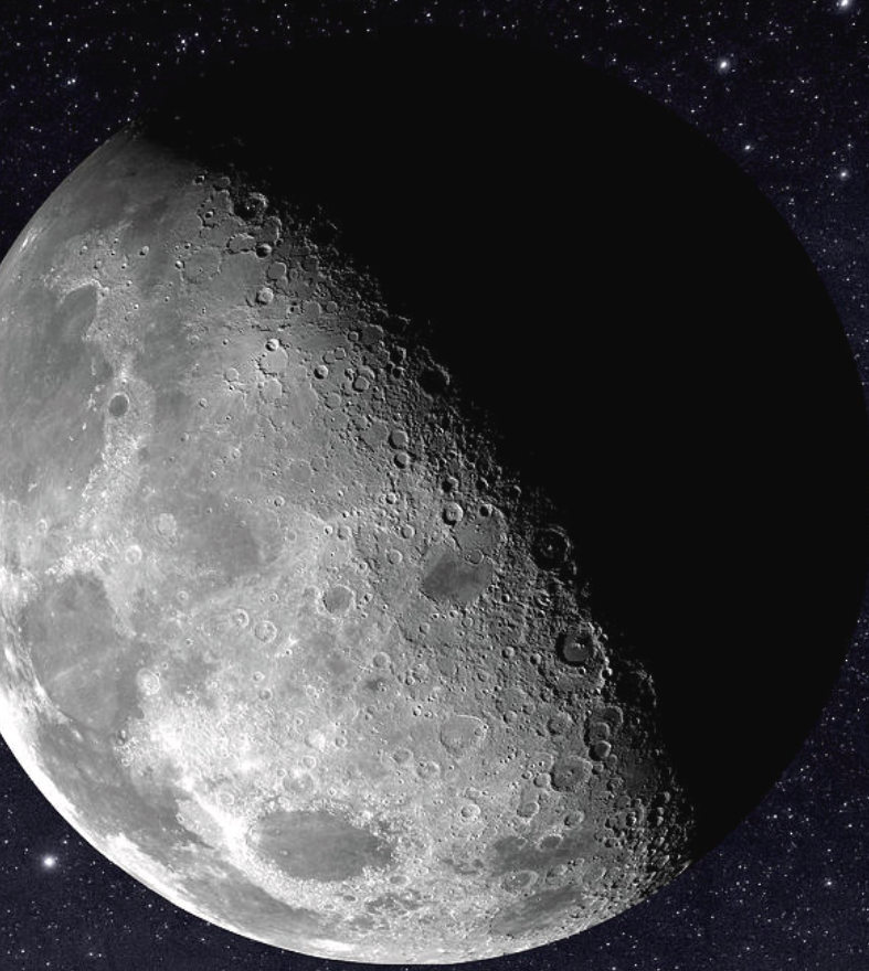
Notice how there are no specular highlights... the "light" area is overall pretty flat, and so are the darker shadows. The pivotal thing here is the edge of the shadows... I'm sort of making detail (all the cracks and grooves) leak out from the edge in the midtone area because that's where the most detail and texture appears in real life. I call this the "moon effect" because that's what the moon looks like in shadow..
Basically, midtones = more texture. Highlights/shadows = less texture.
Force
Most living creatures move... so it follows that to make a drawing more "lifelike", it should look like it's "moving" or "can move".
Turns out there's a whole book about this! It's called FORCE. You can check it out here or buy it for like 50 bucks:
I'll summarize it here.
Shapes can either be "forceful" or "non-forceful".
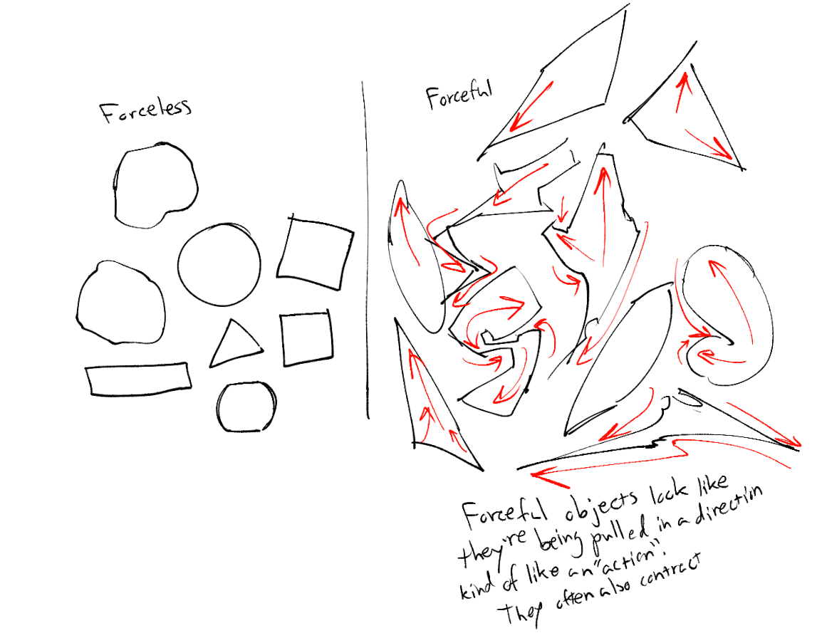
The goal with force is to achieve a dynamic and rhythmic flow to your shapes, and to make it look like they're "acting on something" or "being acted on by something".
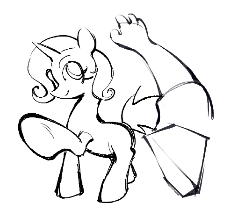
To establish a "rhythm", you can basically take several forceful shapes and stick them together. Here's an example:
You can see the "force" in these shapes going left.. then right.. then left.. and so on. When one side pulls, the other side pushes. When one side expands, the other contracts.
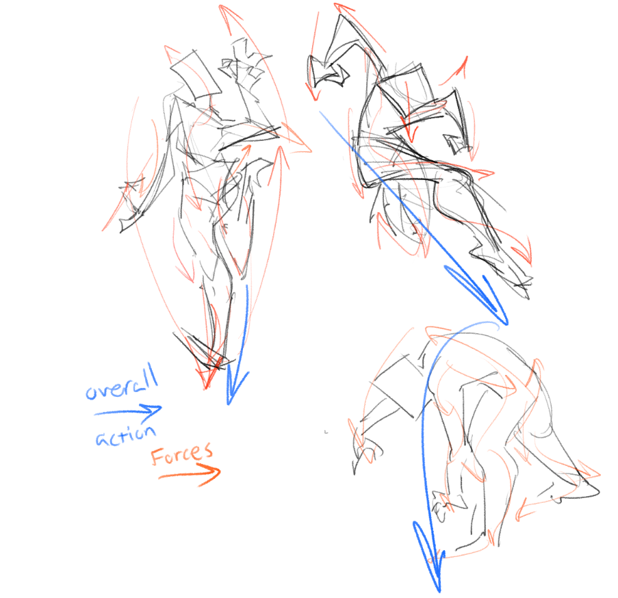
Force is slightly reminiscient of the "line of action" in figure drawing. It's basically an extended version of that which can help create good lines of action.
When you're drawing with force, really consider the different kinds of real forces that could be acting on a shape, like:
- Protruding muscles/bones
- Clothing folds
- Gravity
- Wind
- Looking towards something of interest
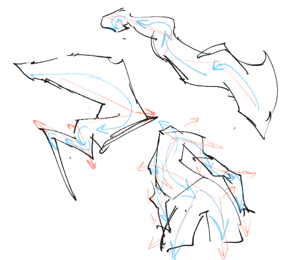
Lineart w/ Force
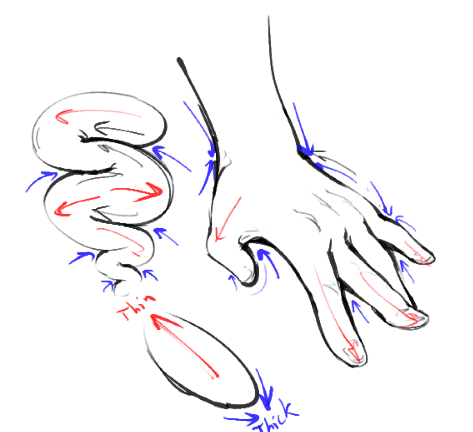
You can see force "stretching" the lines, so that the anchor points are thick and the tension points are thin.
I also tend to thicken lines the further down they are, the closer they are to the viewer, and whether they're outside a drawing or some part overlapping another part, but this is all artistic preference.
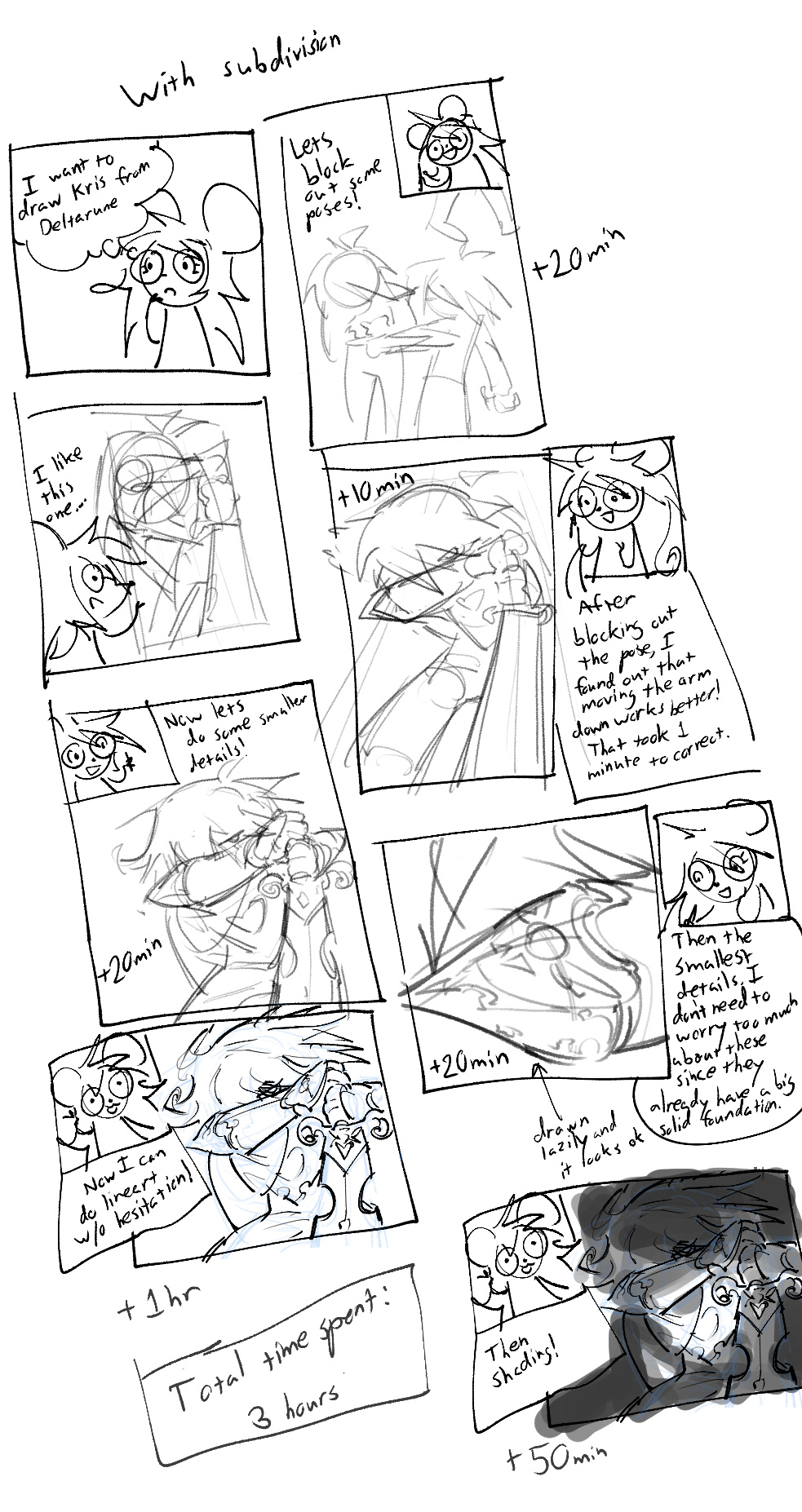
Subdivision
You might've seen a super complex, detailed drawing/painting before and thought "Man... how would I even go about this?" or "How long would this even take?"
The answer lies in subdivision!
What is subdivision, you may ask?
Well, I took this term from 3D modelling. It basically is taking a simple, low-detail object, and dividing it up to have smaller and smaller, more minute details. Notice how the faces here get progressively smaller.
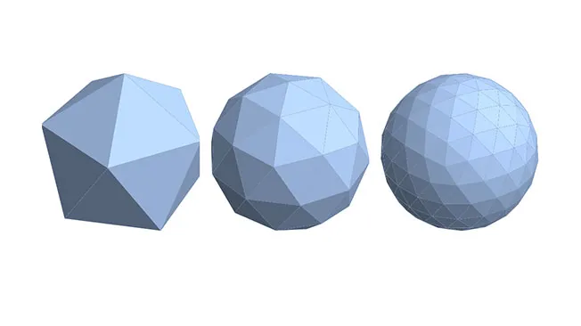
That's the process I try to approach complex drawings with:
- Make some simple "base" drawings. They should be almost completely lacking in detail except for the general idea. Pick the one you like the most.
- On top of this base (without interfering with the overall shape!) Add A FEW medium sized details onto it.
- Then, add SOME small-sized details.
- Then, add A LOT of tiny sized details
- Keep going until you're satisfied.
I know, it sounds fairly obvious. You're probably thinking "Well I do this already!" and you might be right.
But the point I want to make is that you should follow this to the Absolute. In other words, don't skip steps, and don't go back a step. You should not be adding minute details before you've finished your anatomy.
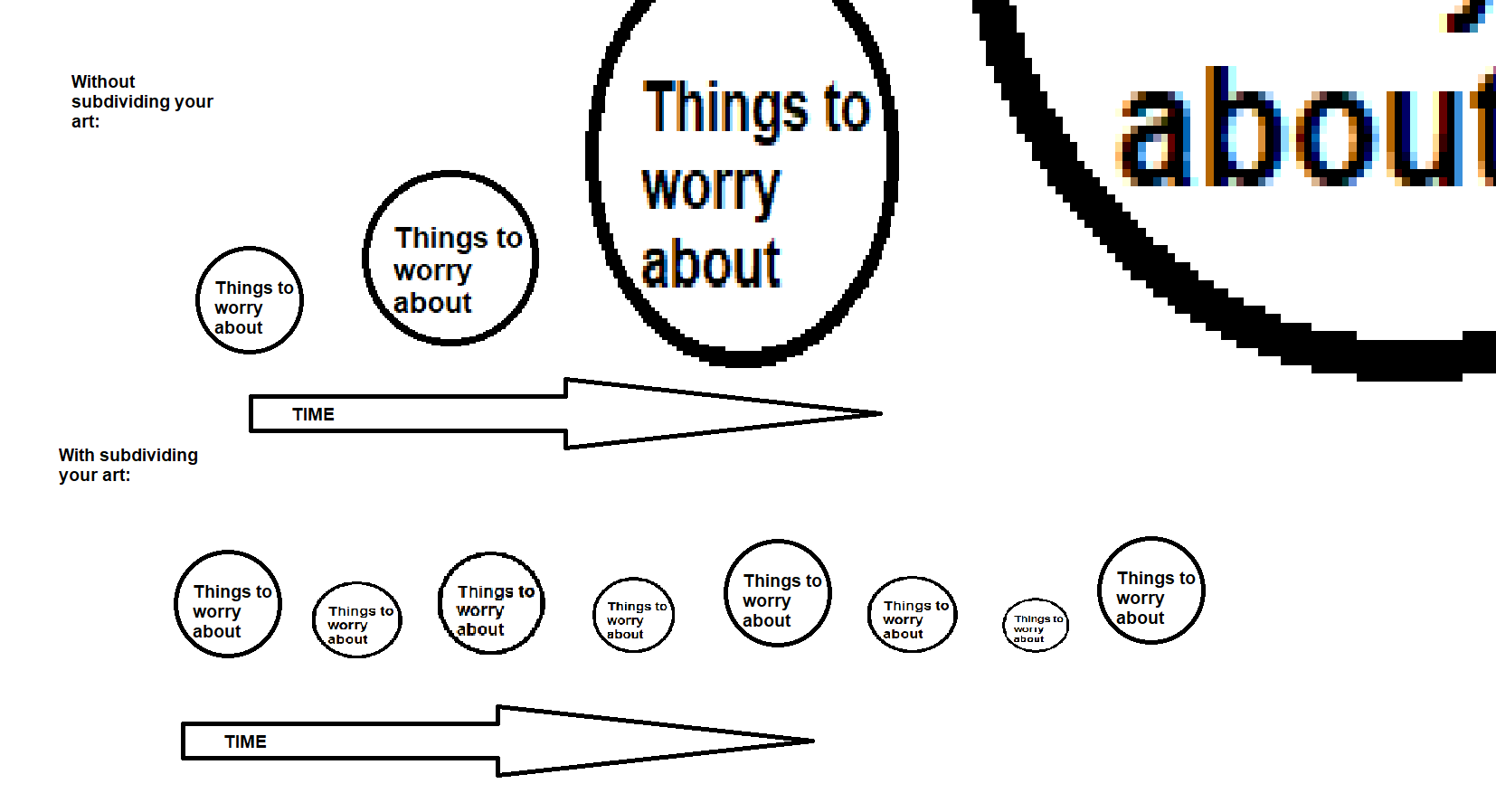
Here's what your life will be like without subdivision:
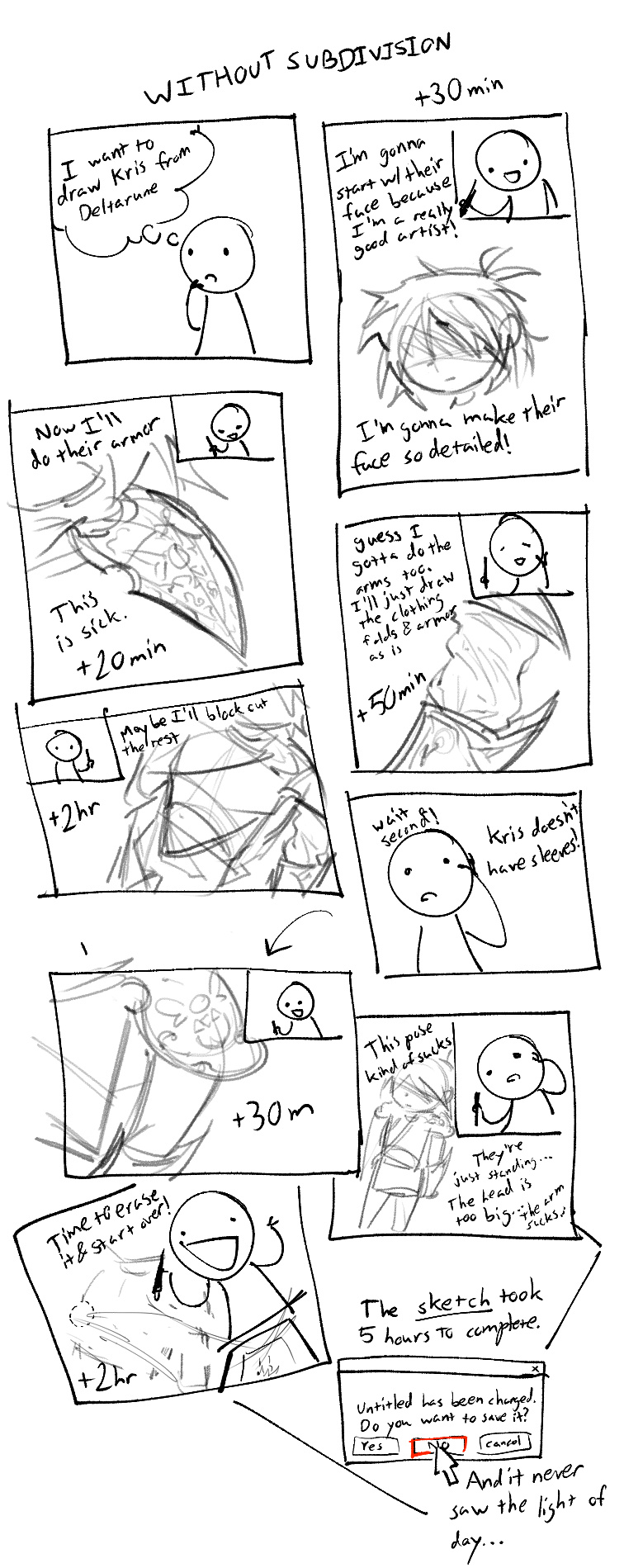
I'm being a little hyperbolic here, but you get the idea, right?
The subdivisionless person did get a lot of cool details in, but they *didn't work* because they didn't even build a foundation for those details to exist on. So when they realize they accidentally fucked up the foundation, they erased all their hard work! It's horribly inefficient.
The main point of subdivision is to ensure that everything you have so far is *absolutely good* before moving on. Here's what this is like:
You an see that from the very start, a solid drawing already existed. Like, you could probably post that online already. She went through 1000 bad ideas several seconds at a time, and found a good one in a matter of minutes. This is a lot better than seeing a fundamentally bad drawing all the way through for several hours, desparately trying to fix it (this is what I call "turd polishing"), giving up and trying another bad drawing for several hours.
It also gets rid of the anxiety in later stages. The lineart is practically tracing the sketch, because it's already there, just waiting to be cleaned up. The workload doesn't balloon each phase because it's been cleanly divided between them!
As with all art, it takes a while to get right. You might've done the latter many times before. This section is more of a warning to NEEVERRR do the former. Not even a little. It always always sucks, don't let your hubris get the best of you.
How to navigate Color Space
It's time to get into renderslop now. That's gonna be the bulk of the rest of the things I add...
I think to render well, an intimate knowledge of how light works is imperative. The way you render will become less composed of "suggestions" based on art habits and more on a fixed set of ideas and rules that work well...
Light travels in countless light rays, each with their own wavelength. These rays bounce all over the place, and eventually they'll end up hitting your eye (or a camera).
Your eye sends the signals created by the light to your brain, and your brain interprets those and creates an image in your head.
Of course, light rays are incomprehensibly small, so your eyes tend to process a combination of multiple light rays added up.
There are 3 dimensions of light:
- Hue - What's the wavelength of the light ray? What's the average wavelength of a bunch of light rays? (Long wavelength -> Reddish, short wavelength -> blueish purple)
- Chroma/Saturation - Out of all the light rays, how different are all the hues? Are they all the same wavelength? (A pure, saturated color) or many different ones? (An impure, desaturated color)
- Value - How many light rays are there? (More -> brighter, less -> darker)
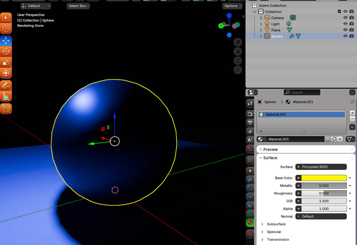
The color of an object/material is determined by which hues it reflects back into your eyes (all others are absorbed). I'll call this "albedo" because that's what most 3D programs call it.
Here's a POP QUIZ!
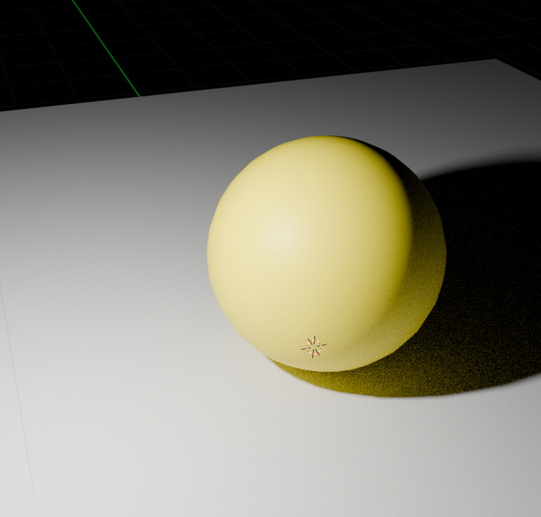
If I shone a pure blue light onto a yellow object in a dark room, what color would it appear as?
- Pure Blue
- Gray or a desaturated blue
- Yellow
- Black
The answer is....
Pure Blue!
It sounds counterintuitive but think about it. A pure blue light would have no other wavelengths to shine onto the yellow object. This means the yellow object would only recieve blue wavelength lights. It might reflect a few, but it'll absorb almost all of them. Anything it DOES reflect would still be pure blue.
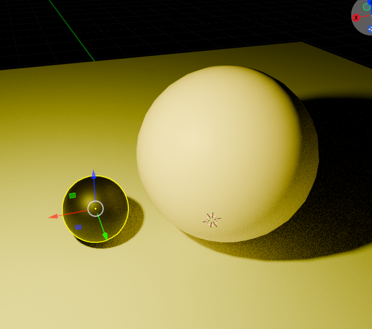
But if I desaturated that light a bit, the yellow would immediately start showing through, as it will reflect all the yellow rays bundled into the impure blue light rays:
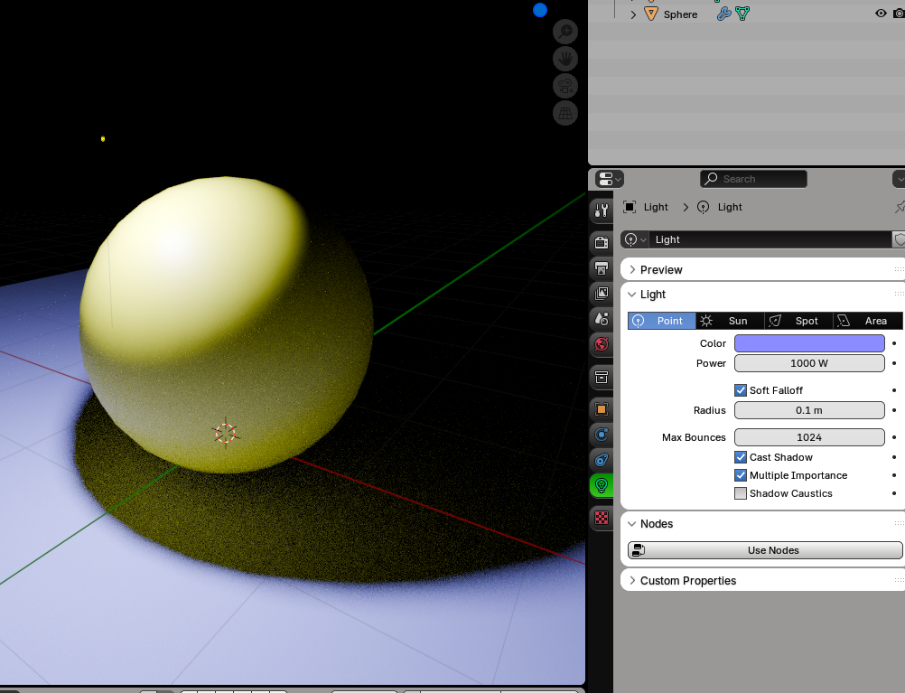
For the sake of completeness, here's a white light:
And a yellow light (with a blue sphere for illustrative purposes)
Now, let's try navigating color space ourselves!
To help you get a grasp on this, I'll present multiple "gradation problems", where you have to come up with a color that fits cleanly "in between" two colors. No cheating allowed!
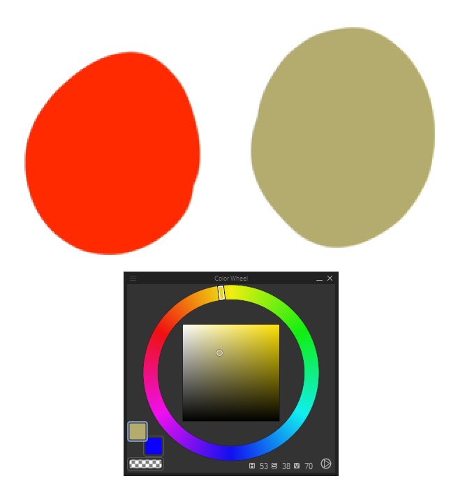
Here's our first:
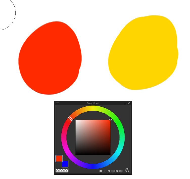
Easy enough, right? All we have to do is go to the hue halfway in between.
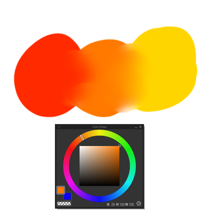
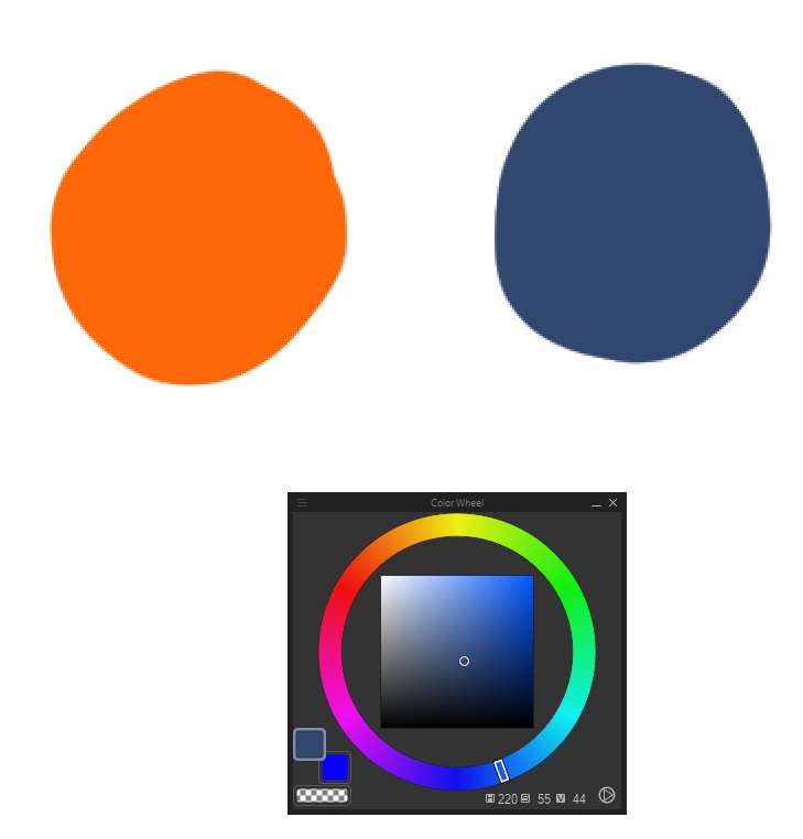
That worked pretty well! What about this?
That's a bit harder... the hues are in the same place, but the saturation and value are different.
Let's try to just do half the saturation, and half the value.
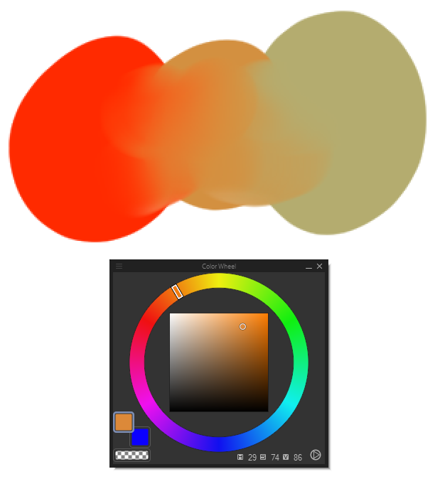
That also worked pretty well!
By the way, try dropping this into your art software, switch to the color picker and try to drag across this gradient. You should be able to see how the cursor in your color wheel moves...
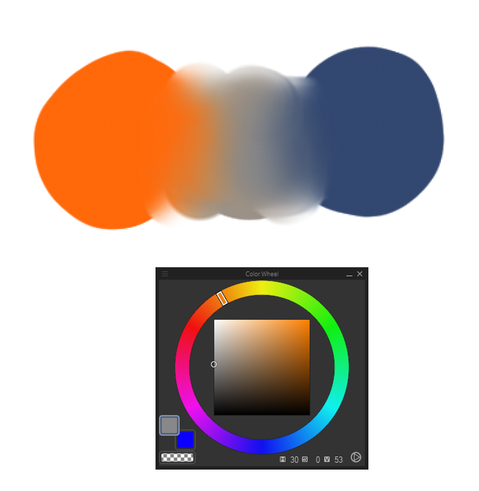
Let's do a harder problem. What about this?
Not only are the value/saturation different, the hues are on opposite ends of the color wheel!
Let's just try to do what we did before... let's go clockwise:
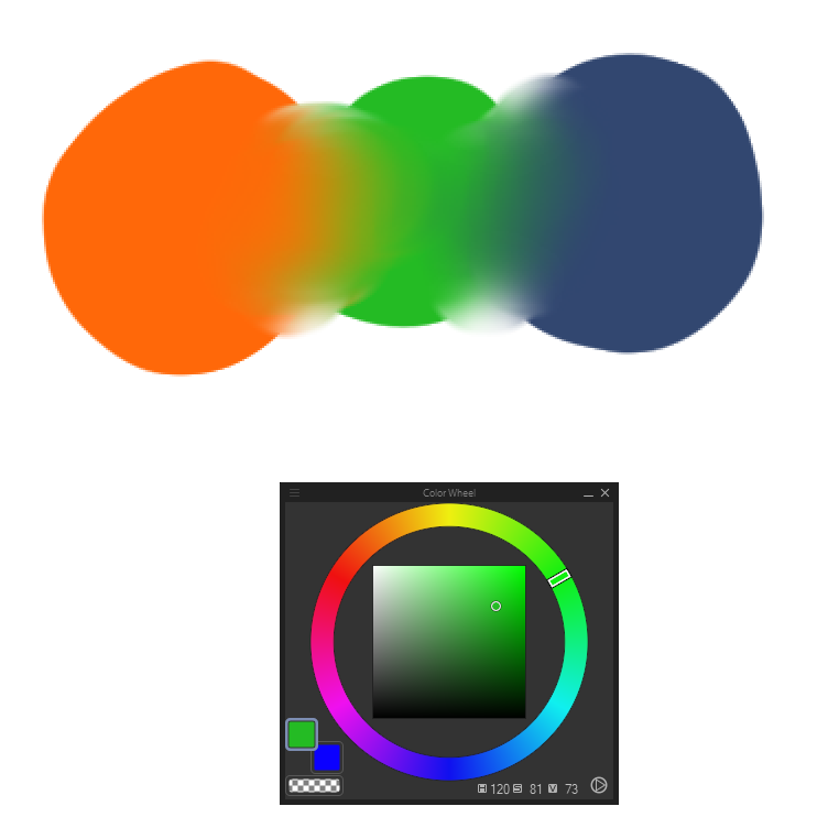
That doesn't work at all.. it's kind of garish, we wanted a smooth transition from orange to blue, where the heck did neon green come from? Is this really what you expect from a gradient of 2 colors? We'll need another solution.
We've just been traversing hue so far to bridge colors... what if we did something else?
The answer is to traverse through saturation. Let's look at an artist's color wheel. By traversing via hue, we're effectively taking this path:
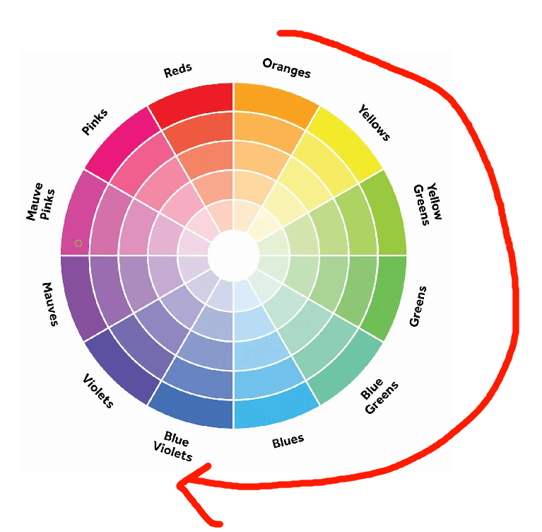
It's a pretty roundabout path... isn't it? we're running into like 6 other colors here, but we know that's not how light in real life works. Otherwise everything would look rainbow.
The trick is to take the much shorter path:
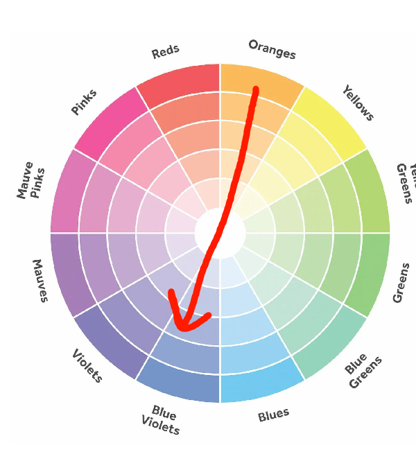
The "gray area" here acts like a subspace portal. Since impure colors contain every hue, white/black/grey harmonizes well with any color. Let's try this!
It's not... GREAT... but it definitely is an improvement over the green jumpscare!
The grey here acts as both a "blueish orange" and a "orangeish blue", which helps bridge the two hues.
However, we can do better.
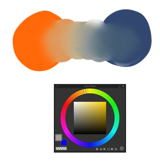
Here's a path I took by traversing through yellow and cyan a little bit. This creates a semi-bridge of two analagous colors, grey, and then two more analagous colors. I usually prefer to do this.
Try dragging your color picker across this! Experiment with it! It's very fun. Try bridging different color schemes, and try bridging 3 or more colors.
Basically, if a hue-based color transition looks garish, try using greys and desaturated colors as a bridge.
More to come! Maybe
(You can click headers to return to the top)