Bending RGB to your will
Are you tired of following a billion different tutorials on how to use this accursed thing?
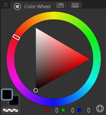
Probably not, but I don't really care. Let's talk about RGB.
The back of the human eye is filled with cones and rods. Cones are more perceptive to color, and work better in bright lights. Rods are more perceptive to brightness/value, and are reign dominant in the dark. (This is why things tend to look less colorful in the dark.)
While there's only one type of rod (detecting light intensity), there are three kinds of cones: red, green, and blue. (We have ~6 million cones and ~120 million rods.)
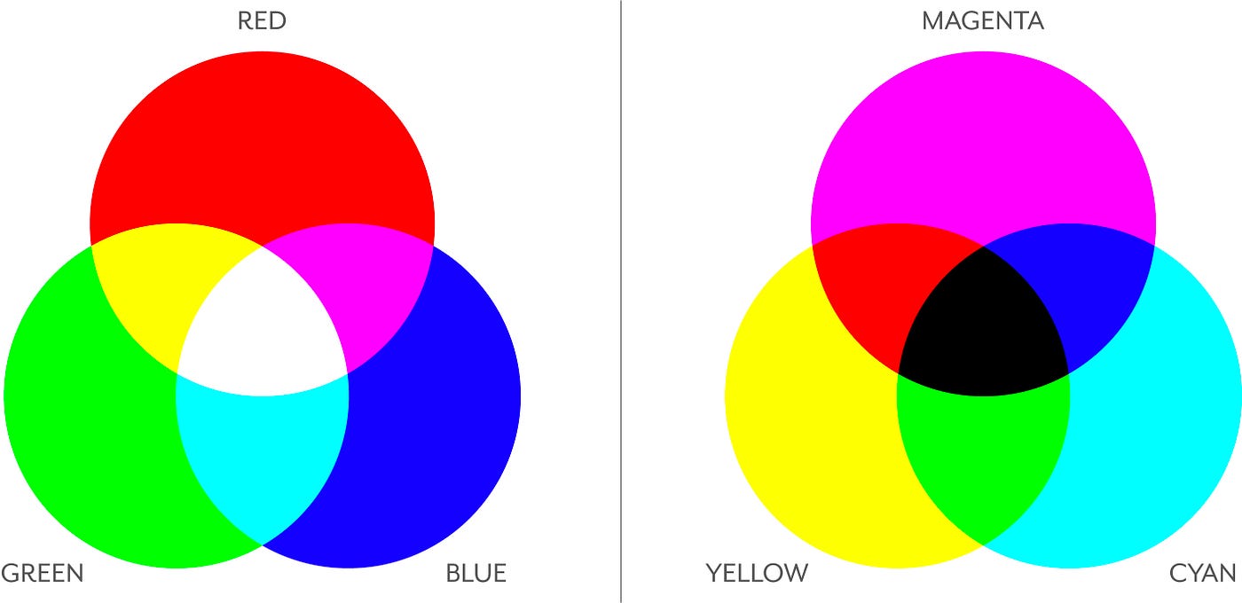
Computer screens are made to convey images with light to the human eye. Because of this, their pixels also use Red/Green/Blue colors. These work (usually) by shining a backlight on the pixels (which are usually an array of Red, Green, and Blue liquid crystals). To change the color of a pixel, the liquid crystals (are usually) rotated/twisted to let more light through.
This is called Additive Color Mixing, the practice of letting more light through a set of color filters/receptors to combine them.
The opposite of this is Subtractive Color Mixing (Used in printers and paint), which is the practice of layering colors on top of each other to mix them, and let less "light" from the white paper show through.
The reason screens use additive instead of subtractive color mixing is because... well, a screen would be pretty lousy if it didn't have any light! Meanwhile, paper doesn't emit any light, so we want to subtract from its baseline amount of reflected light.
Ohhh my god im an artist who cant read just get to the point and tell me how to paint gooder
Ok fine god i'll stop being a color autist for a second.
First let's all get our RGB sliders ready. These are paramount for the rest of this page.
CLIP STUDIO PAINT:
- Window > Color slider
- Drag the panel somewhere helpful, like under the color wheel.
Photoshop CC:
- Window > Color
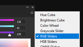
- Note: I recommend using a better color wheel plugin, like Coolorus. It's incredibly good (lets you see the color wheel/sliders at the same time, among other things) and only $17.
Procreate:
- Tap the color circle thing in the corner
- Select "Value" at the bottom. The RGB sliders are the second trio of sliders from the top.
Everything else:
- Google it, silly!
In order to find the color we want, ingrain this useful image into your mind!
Also, try messing around with the sliders a bit, just to get a feel of them.
There are several "rules" of RGB we can glean from doing that:
- All the sliders go from 0 > 255.
- R + G = Orange > Yellow > Yellow-Green
- R + B = Magenta > Violet > Purple > Indigo
- B + G = Turquoise > Cyan
- Moving all the sliders together changes the brightness of a color.
- Moving the sliders closer together decreases the saturation of a color.
And that's... basically it!
No seriously that's all there is to RGB. You're just manually adjusting the pixel color, that's as simple as it gets.
...
Ok that's kind of a lie. Those are the *base* rules, but we can derive several bonus rules from that.
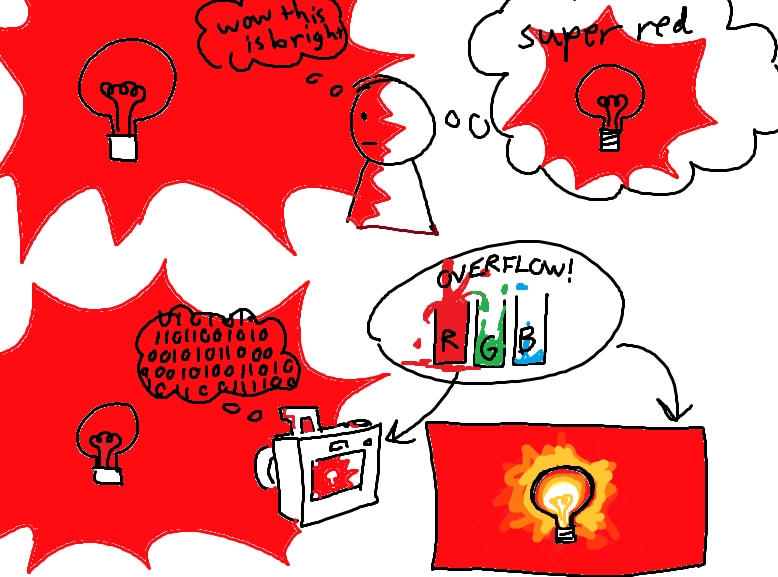
- You might've noticed that "maxing out" one slider (setting it to 255) isn't necessarily "bright".
- This is because a computer screen typically has uniform brightness. All the pixels have the same amount of backlight, so there's no way to make a pixel "redder" than 255.
- Our eyes can perceive a MUCH higher range of value, so we tend to perceive red lights as "more bright red". A computer screen can only occupy a small amount of that value range.
- Cameras/3D renderers make up for this disparity by "clipping" colors. Basically, they treat white as the brightest color. Then, after Red reaches 255, the Green/Blue values increase until they both reach 255.
Light overflow:
Here's a visualization:
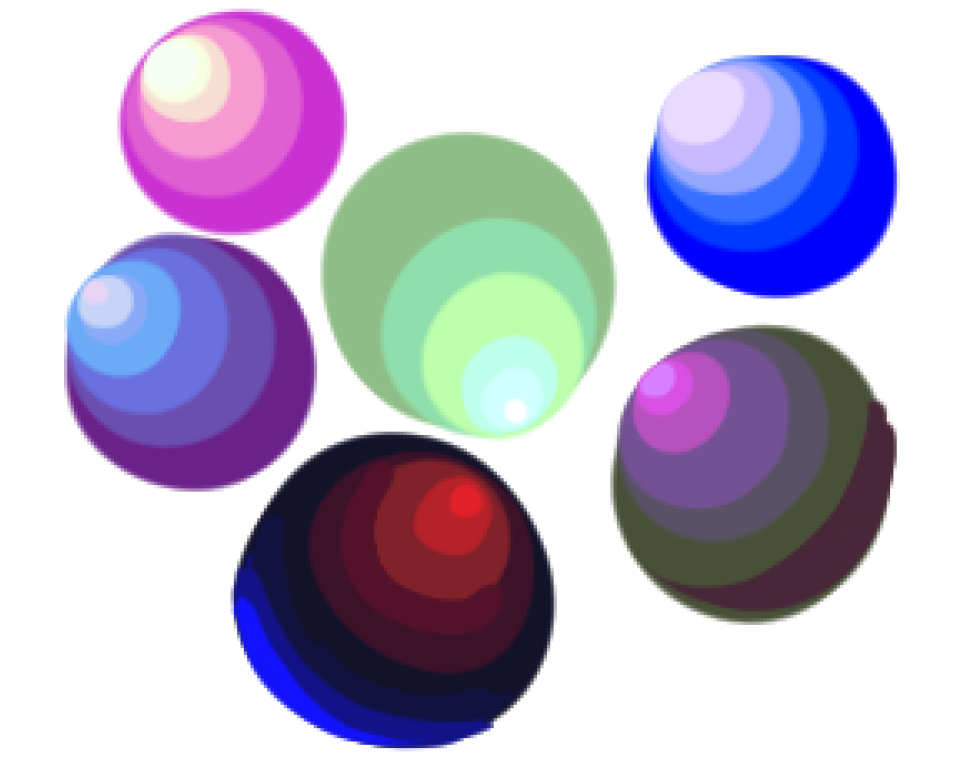
Here are some examples of this effect in Blender (A 3D modelling/rendering program). Feel free to color pick them and see the changes yourself:
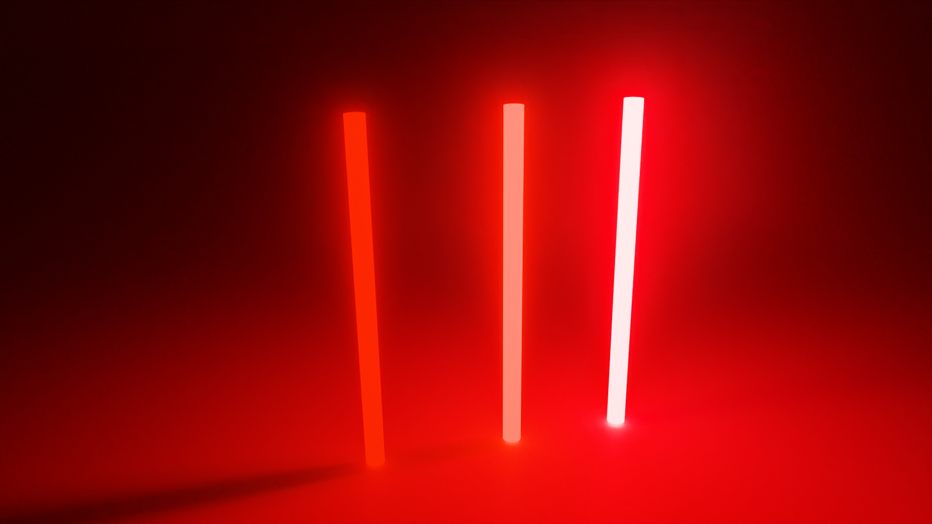
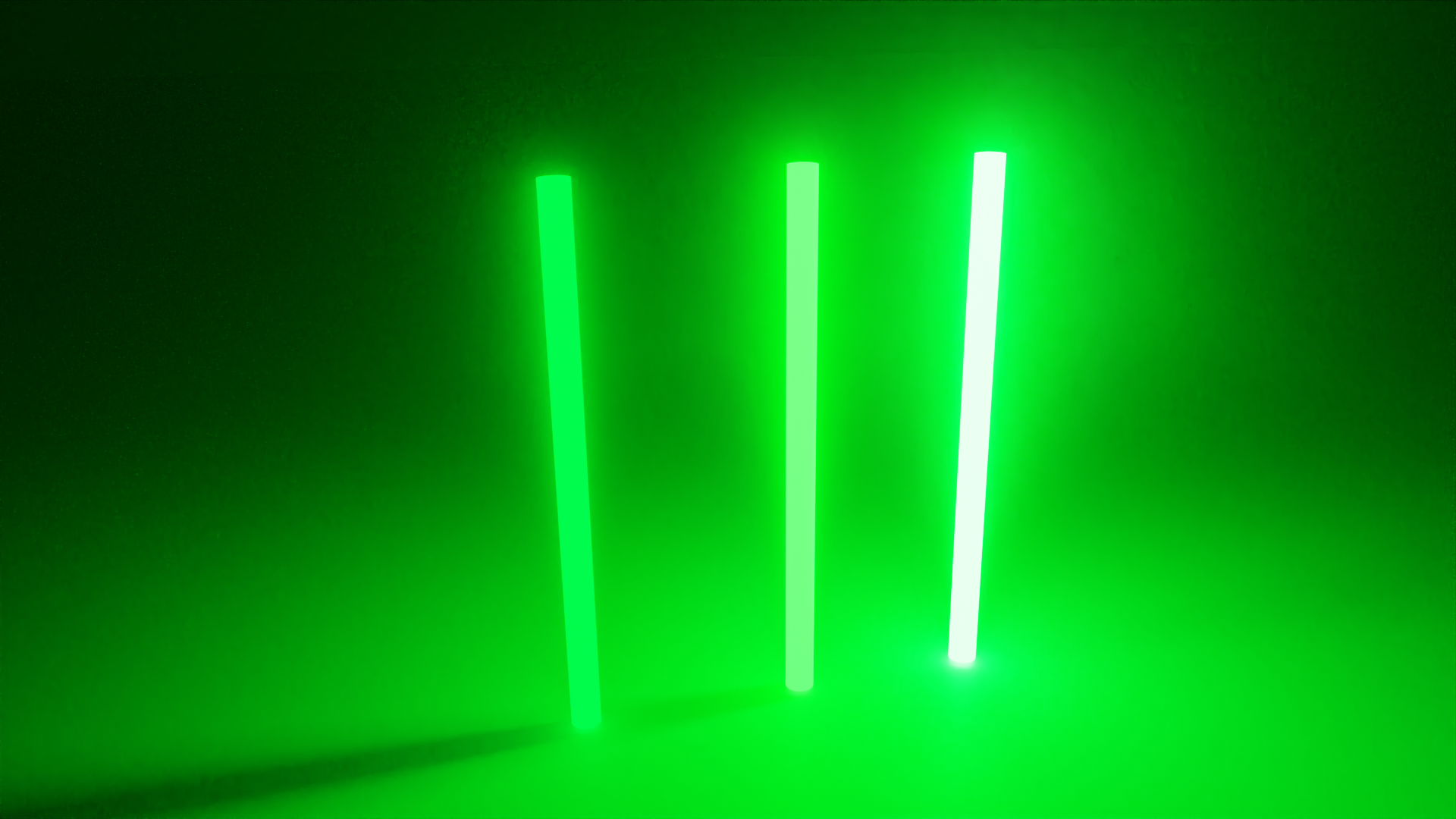
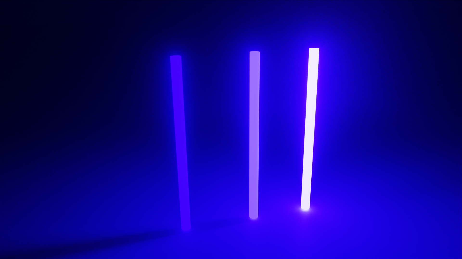
Overflowing lights in your art can REALLY make lights pop, especially for highly saturated lights.
Cool indirect/ambient lighting:
Indirect Lighting is light that bounces off of other objects in a scene.
Ambient lighting is an extension of indirect lighting, and is the average of all the lights bouncing off an environment (including the subtle blue light of the sky, if outdoors at daytime.)
Getting solid-looking indirect light with an HSV color wheel can be... pretty difficult and annoying. They tend to be washed out and muddy if you don't take into account like 50 different rules, which is lame.
RGB color sliders make this a lot easier. To add ambient light, all you have to do is the following:
- Figure out your base color. (easy, just use the eyedropper and move to the next step.)
- Figure out (roughly) the color of the ambient light and take a mental note. (The color of whatever the light is bouncing off of, or the color of the sky)
- Add the ambient light color to the base color. This is our "goal". Take mental note of this.
- Move all the RGB sliders from the base color to the "goal" color, but only a certain amount. Stop when it looks about right (depends on how bright the ambient light color is, along with how many "bounces" the light would theoretically have to make to reach the object).
Here are these steps in action! (Click to open image in a new tab)
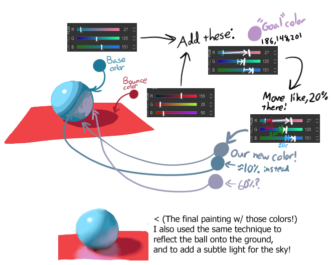
This is just the start of a long, long rabbithole. You can get weird but appealing and accurate color transitions in RGB that you'd have to go out of your way to find in HSV.
But what about the other color spaces? Isn't RGB like, inaccurate or something?
Technically? The human eye responds differently to Red, green, and blue.
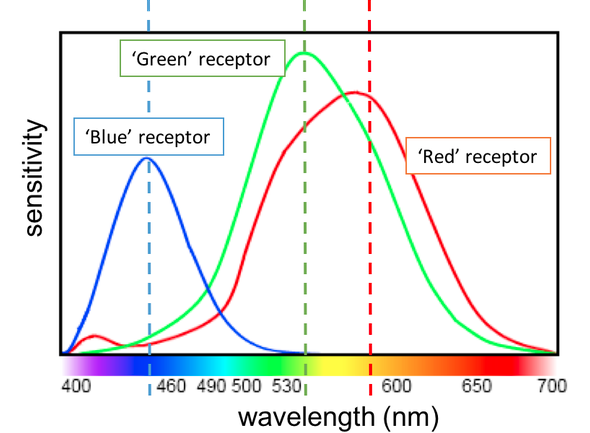
However, this mostly pertains to computer graphics, where the computer is solely responsible for choosing and tweening colors, or finding their brightness.
When we pick/mix colors manually w/ RGB, we're still doing that perceptually with our eyes. Regardless of what color space you use, the final result will be the same on-screen color (Pixels can ONLY hold Red/Green/Blue information!)
Making a color "bluer" will make it bluer, regardless of what color space you're adjusting in.
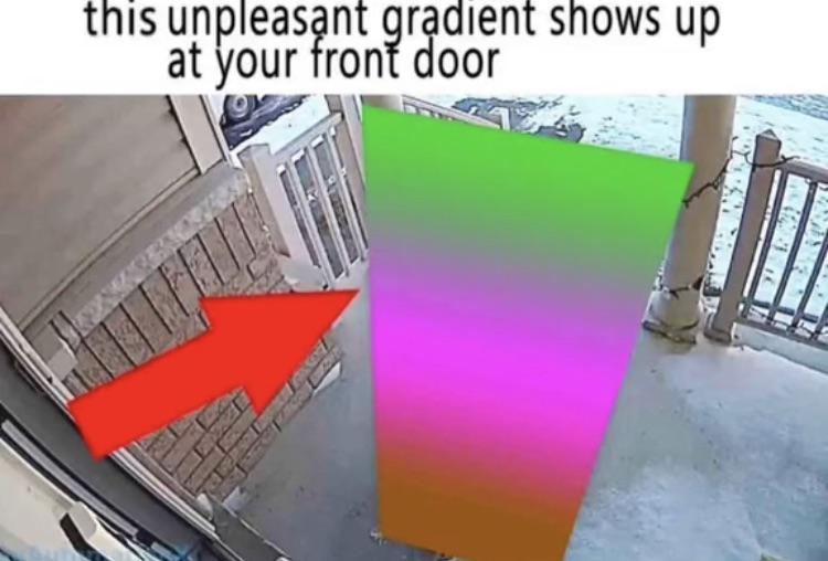
Just don't be dumb and pick ugly gradients. That's all lol.
In conclusion:
I literally spent all night writing this (oh god its 7am already) so I hope you leave this with newfound knowledge abt RGB sliders. Maybe you'll use them, maybe you won't. Just know they can always come in clutch if you're struggling to mix a color. BYEEE!!