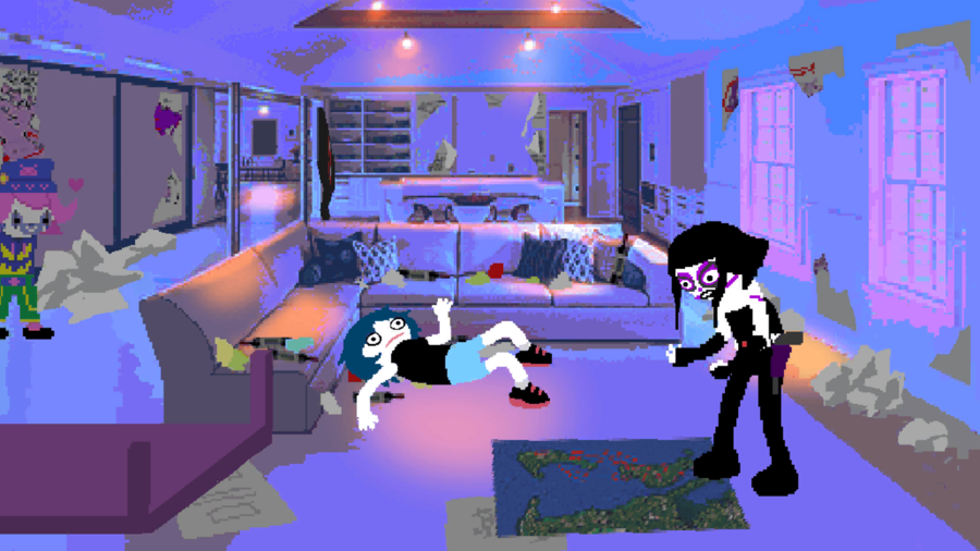
Psycholonials Style Guide
Psycholonials is a free visual novel by Andrew Hussie. Check it out here.
This is a guide for recreating the visual style of Psycholonials, based on my old (deleted) one. The material will be pretty much the same, but shorter (and better).
.png)
Examining the style
Ok, first here are some important things to pay attention to:
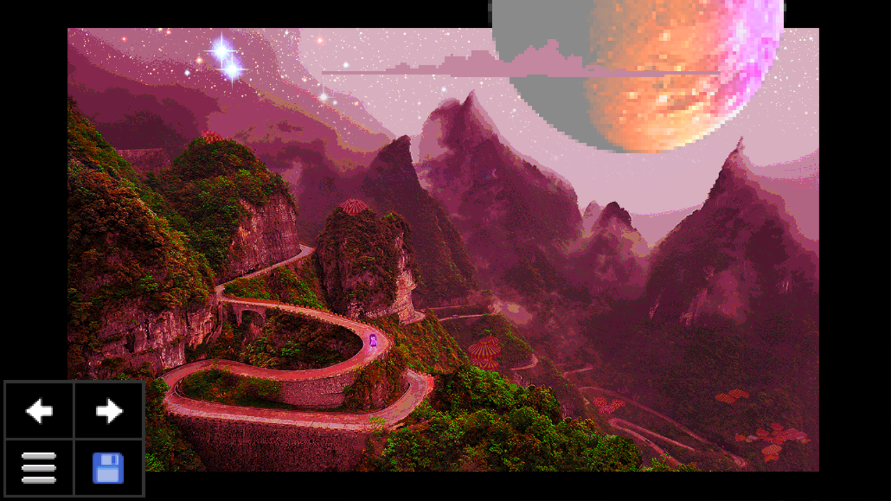
- Mixels - Probably the most obvious thing here, a lot of pixel sizes mismatch.
- Lineless pixelated character art
- "Banding" in the backgrounds - likely caused by GIF compression and posterization.
- Uniform background color palettes
- Saturated colors
- Downscale bitcrushing
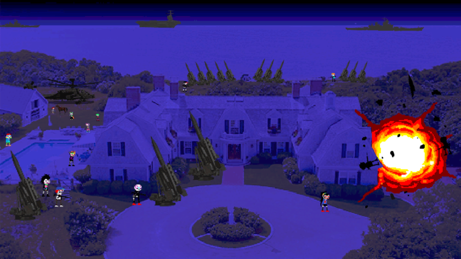
- LOTS of photographs combined with illustrations.
- Drop shadows below characters (most of the time)
- Occasional "Fake skies" - replaced with a gradient or solid color.
The images in the games are all stored as 2048px * 2048px pngs, but they're obviously upscaled from a lower size. I think ~640px tall is a pretty safe guess.
My software of choice for making psycholonials-esque art is Adobe Photoshop CC 2022, since a lot of these quirks are effects specifically caused by it. However, feel free to do your character art in another software if that's easier (just make sure to follow the general tips in this guide!)
Mixels
Probably the most straightforward part of the style. Just do the following:
- Select the layer you want to resize.
- If you want to make it larger:
- Set the scaling interpolation to [NEAREST NEIGHBOR] so it has hard edges.
- Scale it up.
- If you want to make it smaller:
- Set the scaling interpolation to [BICUBIC SHARPER] so it creates bright fringes.
- Scale it down.
- If you want to pixelate it but keep it the same size:
- Is it a real-life image/graphic? If so:
- Scale it down with [BICUBIC SHARPER]
- Scale it up with [NEAREST NEIGHBOR]
- Is it a character? If so:
- Scale it down and up with [NEAREST NEIGHBOR] both ways.
No matter what you do, don't use your software's "pixelate"/"mosaic" filter! It'll look all blurry and nothing like the game (except for Zhen's dad for some reason).
Banding
Banding in Psycholonials is primarily caused by 3 things:
- GIF Compression (The main one)
- Posterization (Rarely)
- Upscaling a gradient w/ Nearest Neighbor.
In Photoshop, you can export gifs with the Save for Web window (Under [File], or with [Ctrl]+[Alt]+[Shift]+S).
However, Psycholonials rarely has animations so you can also save panels as 8-bit PNGs, which are basically single-frame GIFs.
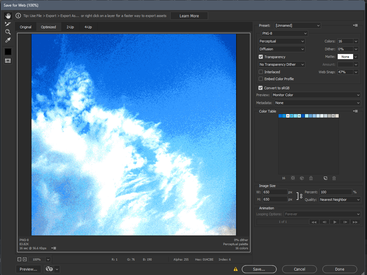
There's a lot of buttons so here's a rundown of the controls:
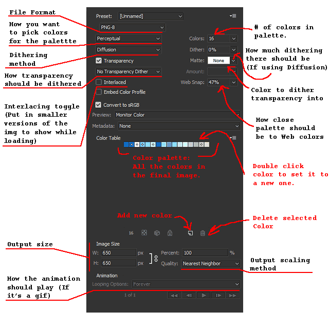
Generally, you'll get good results by setting the dithering method to None.
Uniform Palettes (And tools to make them)
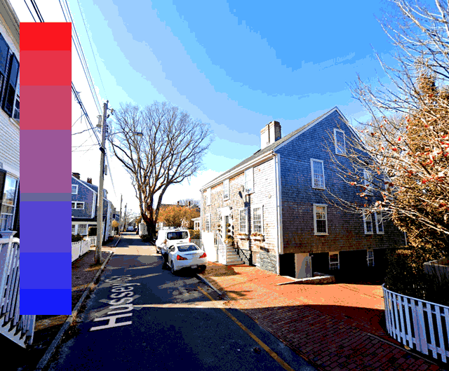
Psycholonials does a lot of effective storytelling with uniform background palettes. Here are some examples I like:
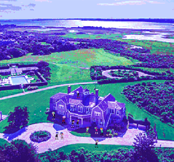
There's a lot of ways Hussie adjusts the bg colors, here are the main tools you can use:
(By the way, I highly advise using Adjustment Layers so you can easily revert the changes.)
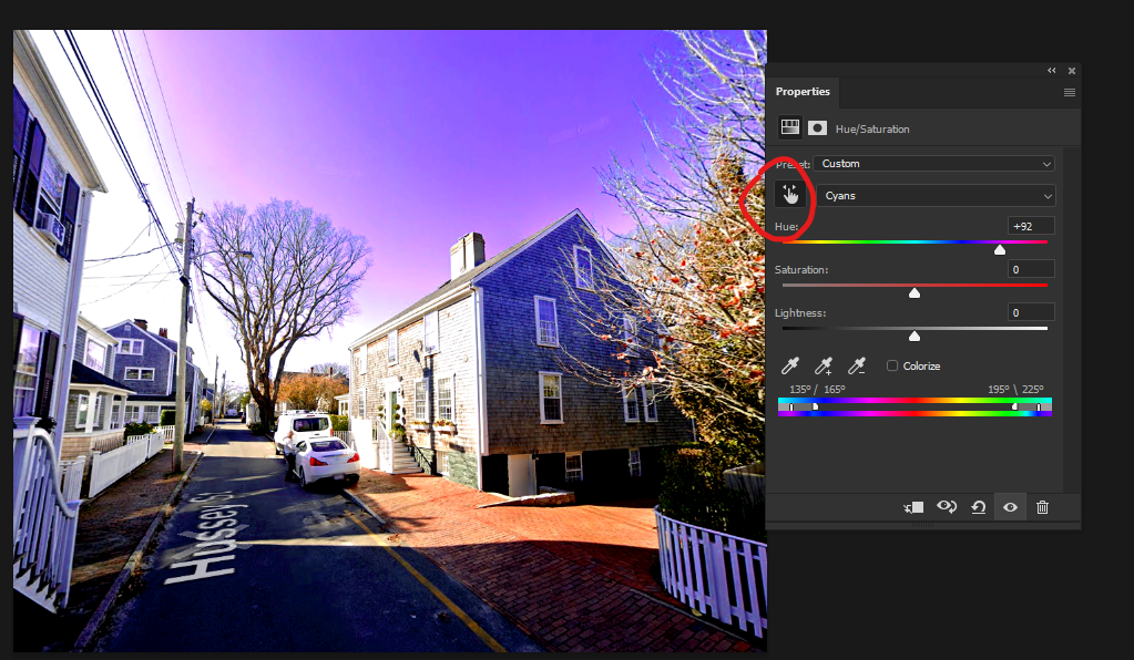
Hue/Sat/Val
A pretty simple one, but did you know you can shift different ranges of colors by different amounts?
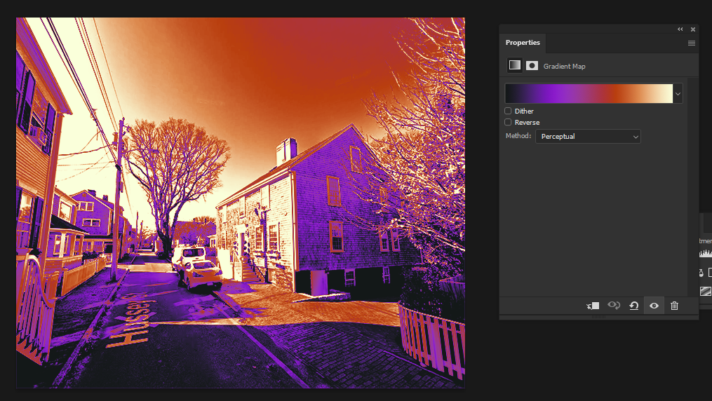
Gradient maps
Good for fitting the whole image into a few colors.
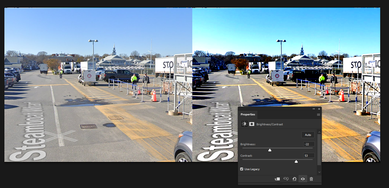
Legacy Brightness/Contrast
Good for making your images feel punchy. I use this on basically every background.
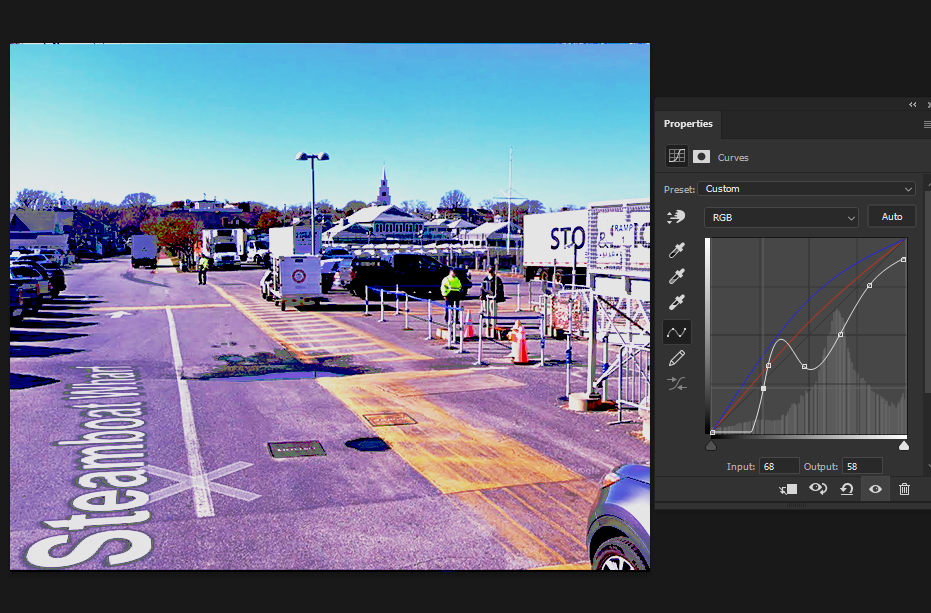
RGB Curves
Probably the most versatile tool here, it's good for making some colors and value ranges feel closer together/farther apart. You can also pull off some pretty wacky effects with it.
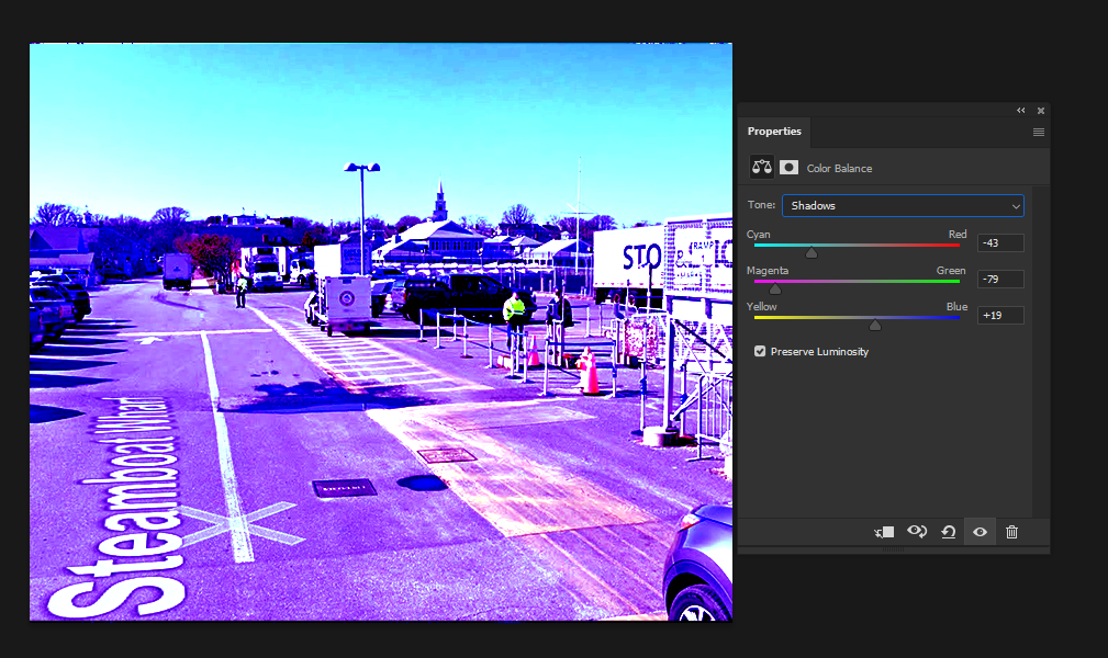
Color Balance
Lets you shift color ranges based on brightness. Also a very strong tool.
And that's basically it! Every background is different, so do whatever you want with these tools (or more) to make it look good.
Night-to-Day
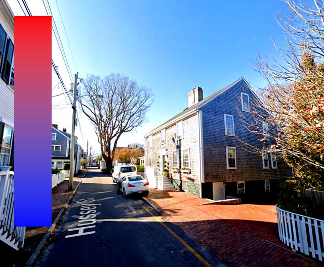
Oh yeah. Most of the images in Psycholonials are from Google Street View, which can create a bit of an issue since a LOT of Psycholonials takes place at night, and Google only photographs during the day.
The way Hussie got around this was editing tf out of the backgrounds to look as if they were taken at night:
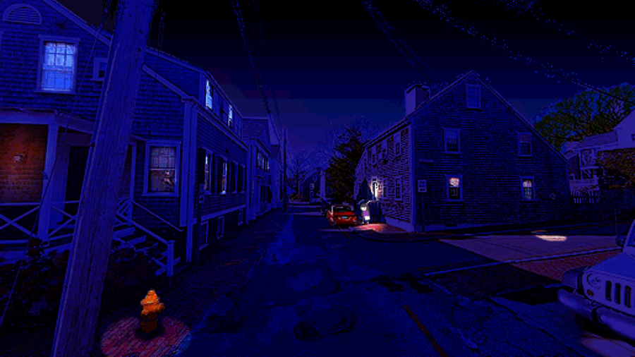
This is mostly done with the following steps:
- Duplicate the image
- Increase the contrast/darkness of the image.
- Cut out the sky (with the lasso tool or magic wand) and replace it with solid black or a dark gradient.
- Gradient-map or color balance to a blue-purple palette.
- With the original image underneath, add a mask to the modified image.
- Select the mask, and airbrush black the parts you want to be lit up. (This creates a soft hole in the img showing the daytime photo underneath)
That's all for backgrounds! (oh also remember to work in fairly low resolutions.)
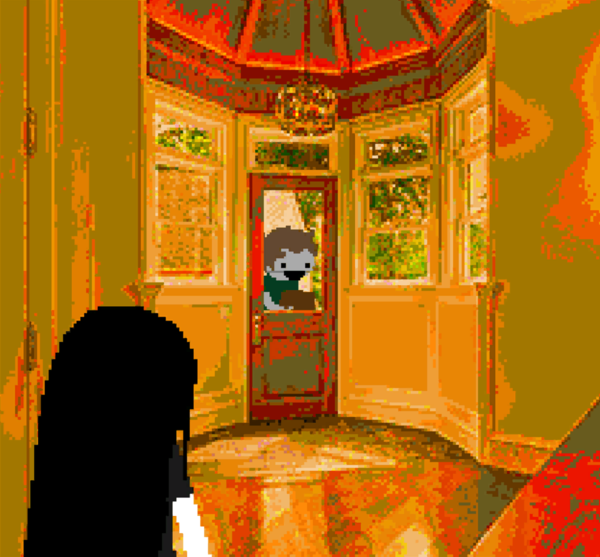
Character art
This is a bit harder since it requires actual drawing skills.
First of all, there are a LOT of ways hussie draws everyone in psycholonials, so I'll list them in order from lowest to highest effort:
- Sprites: The tiny pixel art ones, usually used for zoom-out shots, casual shots, and for background characters.
- Pixelated noodle mode: When the characters are zoomed in, but part of or all of their body is in a low resolution.
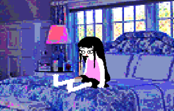
- Normal noodle mode: Characters drawn in full resolution, with noodle-like limbs
- Hero mode: Characters drawn in full resolution, with slightly more realistic limbs, more detail, and (sometimes) perspective.
Let's try Hero mode.
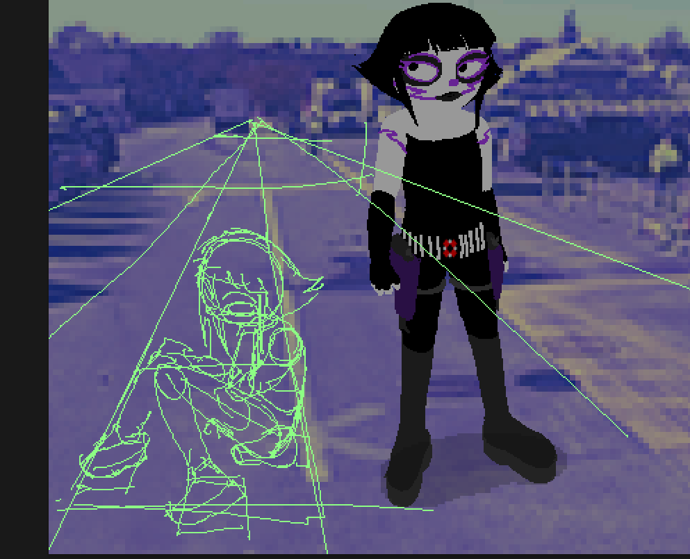
First, I like to do a quick sketch before drawing. This way I can get in a good pose. Also, I draw perspective lines so I have a general idea of where to place/angle the character. Psycholonials has a kind of photographic feeling (since it's literally photobashed), so putting the characters in a "3d space" takes advantages of that and really sells the panel!
Then, I just draw over that with the pencil tool.
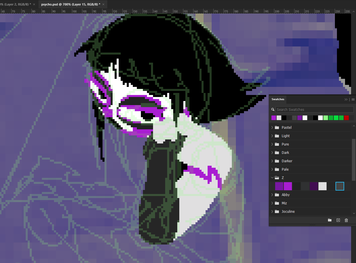
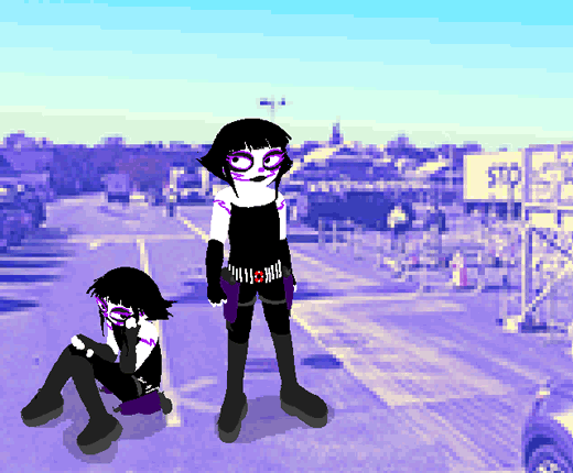
After that, I plop in a drop shadow and it's basically done.
If you want to make part of the character pixelated, just draw that in a lower resolution, and then upscale it and draw the rest in normal resolution.
Wait wait wait what about the anatomy and stuff???
oh yeah umm here you go.
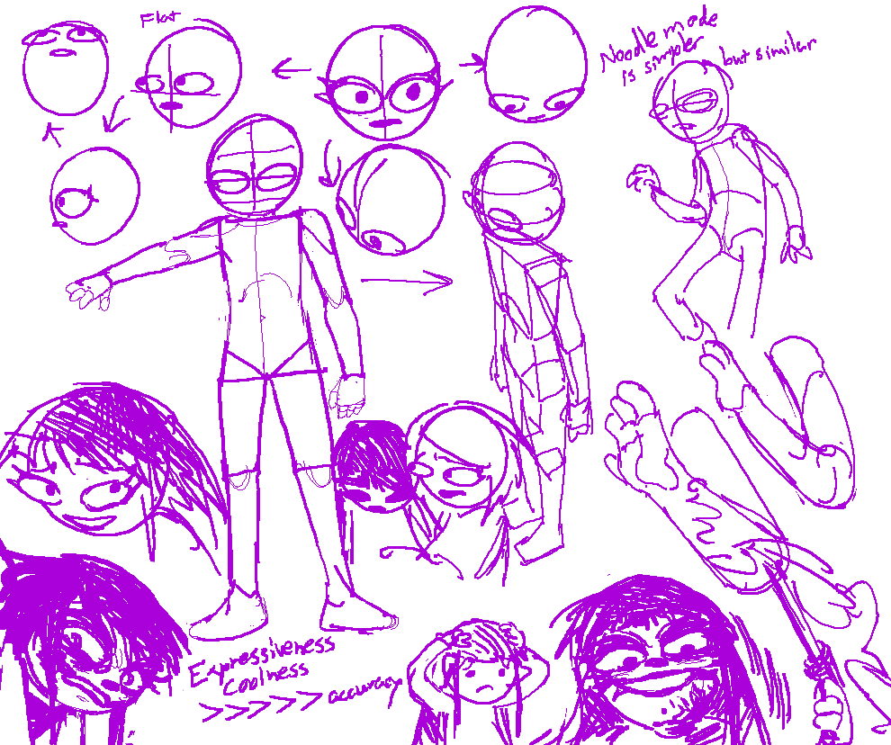
It's just a slightly more detailed version of Homestuck's late act 6 art style. The main differences being that you can see a bit more anatomical detail in the limbs and torso (unless you want to make them noodle arms/legs.)
I think when drawing characters its a lot more important to get it to look Good and Expressive before worrying about total accuracy or proportions.
Also please dont use this guide as a cop out to not learn to draw better. Trust me if you practice drawing normal things you will also get better at styles like this regardless of how simple they look.
That's all!
I hope you enjoyed reading...