So you wanna paint gooder
This is everything I know about painting, and my current process at the time of writing. Enjoy. Or don't.
This guide assumes you have a decent knowledge of drawing, though you'd probably still learn something from this regardless.
The philosophical part (IMPORTANT)
BEFORE we crack open CSP, I think it's important to talk about the philosophies I use when making digital art, because I think they'll be pretty helpful if not crucial to getting the best results.
Frst of all: People tend to approach digital art like traditional art, where they HAVE to do Step A -> Step B -> Step C or their painting will be irreverisibly damaged. (You'll commonly see this as the sketch -> ink -> color process)
While it's totally understandable for traditional art and does work quite well for digital art, in traditional art these steps act as a safeguard to not permanently screw up your drawing, while in digital art this mindset acts as a pair of shackles.
So remember this:
In digital art, you have full, unbounded control over the canvas. Everything you can do can be undone. Every pixel can be re-drawn over. You can save a copy of any iteration of the drawing you want and edit it to hell and back. You can paste in photos, use grids, use filters, whatever. You can paint while drawing and draw while painting. All that matters is the end result. No one is watching how you draw, you can just *do things*. Don't be scared to do anything.
I can't iterate this enough. This is ESPECIALLY TRUE for more painterly and looser art styles. This tutorial applies to both, but primarily concerns the former.
However, this guide is primarily about realistic painting. While you can do whatever you want to reach them, ideally your end goal rests with most of the main principles. Don't underestimate how much sticking with them can enhance your art. That's all.
The painting process
The main key to easily paint (and make art in general) is abstraction, the art of taking a big problem and subdividing it into smaller *independent* problems. It's kind of like this:
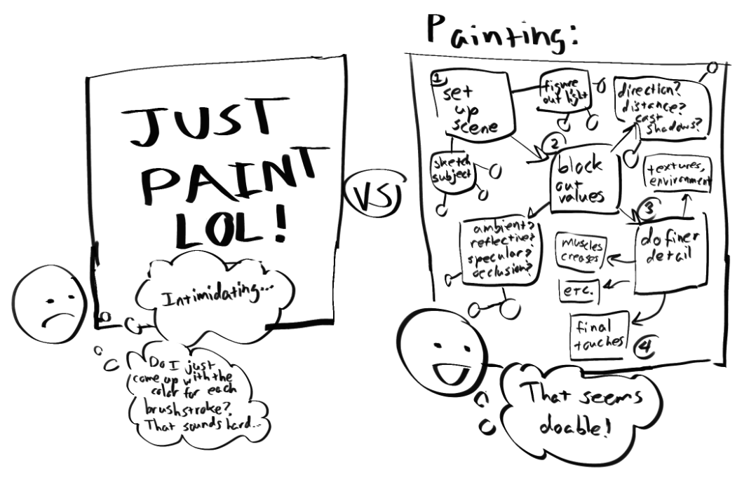
Figuring out the direction a plane faces is MUCH easier than thinking about all of these steps at once trying to lay down brushstrokes in real time. Very few painters do that anyway. It also gives you a visual representation of something to sculpt right on your canvas. Think of it like sketching. Once you do one small step, it'll be much easier to take the next. And the next. Okay anyways:
Step 1: Setting up the scene.
First, just draw your subject. You don't have to give it perfect lineart (it'll probably be covered anyway by the painting) but keep the sketch clean and solid. For everything else to work, you NEED a solid understanding of the FORM of what you're drawing. This is due to one of the most important principles of painting:
Seriously. Do your paintings look flat? It's probably because you're missing out on shading form changes. Loose gestural sketches won't really work for this, try mapping down solid forms that you *understand*. Otherwise, you'd be lacking in crucial information for the next steps which will make this all harder.
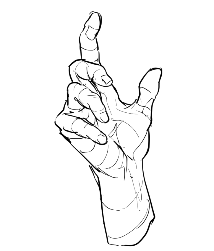
Anyways, so you can follow along I think I'll just sketch a hand again this is kind of rough, but it's enough for me to decipher the important forms (For smaller ones, I can use my brain later.)
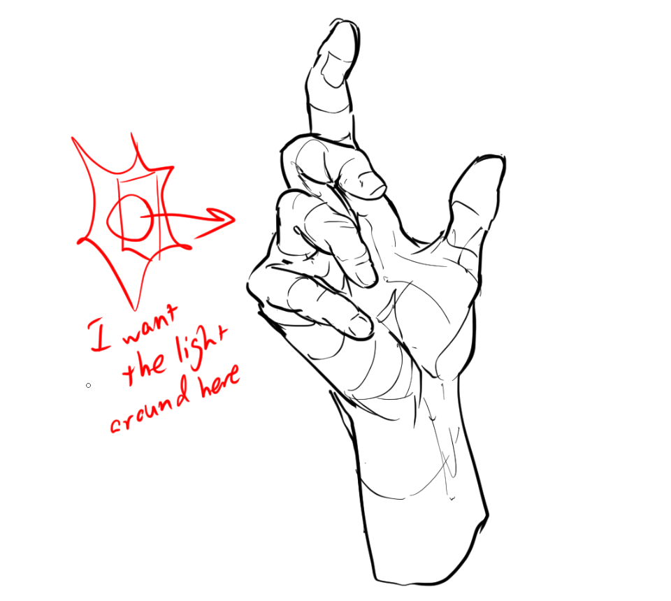
Next, we want to figure out where the light is. This is pretty simple and just a general idea in your head would work.
For this, I'll just use a generic light facing the hand from the side. This will also be drawn with a daytime environment in mind.
Additional things to think about (these might be important!):
- What's the COLOR of the light source? (Or temperature. Is it an incandescent or flourescent light? This affects what colors you'll use.)
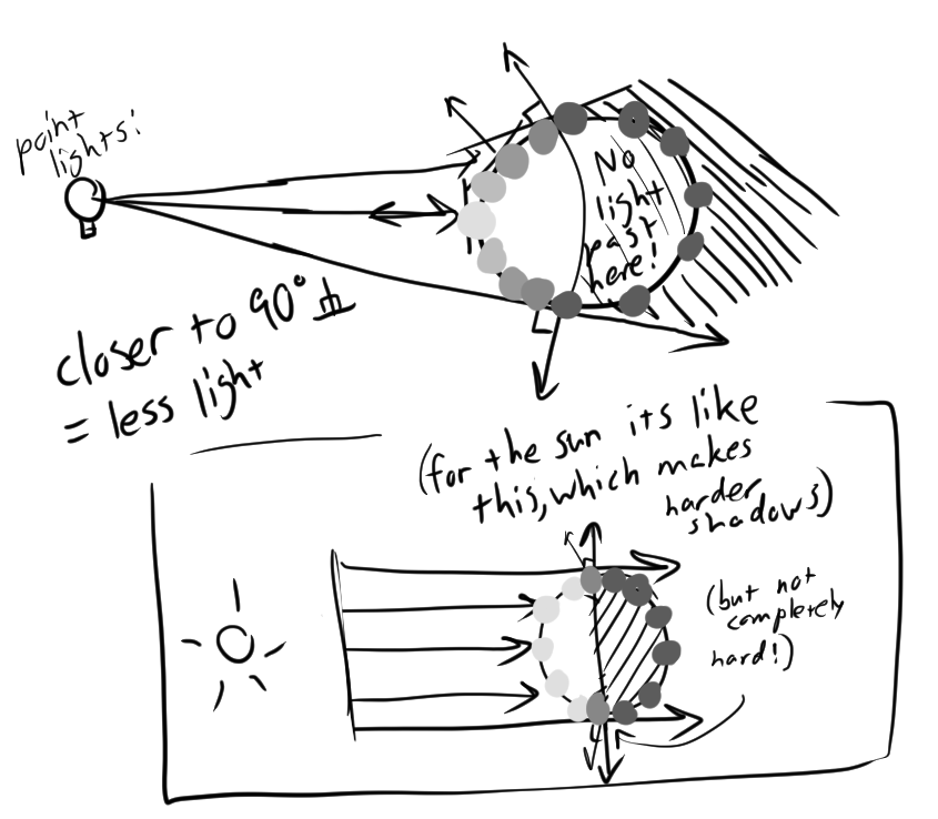
- What's the SIZE the light source? (This affects how hard shadows will be. Big lights = softer shadows, small lights = harder shadows)
- The sun makes HARDER shadows because while it's huge, it's so far away it might as well be a small, really bright light.
- The only difference w/ the sun vs point lights is that all its light rays will be pointing parallel from the sun direction, the angles of shadows won't change over small distances like with a lightbulb.
- What's the SHAPE of the light source? (This is important for speculars, since they're a reflection of the light source.)
- Is the light source an omnidirectional light (open lightbulb), a directional light (sun) or a spotlight? (stage lights, flashlights, projectors)
While not required, adding some variation with these qualities can make for more interesting and dramatic art. There's a reason specialists get hired to do lighting for film!
Now, we want to form a pallette.
A huge mental block I see in painting is treating value as a fixed number rather than a "percentage" of light that hits a surface. This makes it hard to adjust multiple colors to fit a uniform range of value, and is often the reason people fall back to shading with blend modes.
Not here though. We want to get good at painting from scratch, so we're gonna rawdog these colors. Just like traditional artists. Here's how to do that:
Manual coloring: A guide.
Step 1: Choose the base color
This is what your color would look like in neutral lighting. In other words the midtone. The brightness of the base color can vary based on the material.
Let's do a nice even 70% for this. That way, I have plenty of wiggle room to add highlights and shadows.
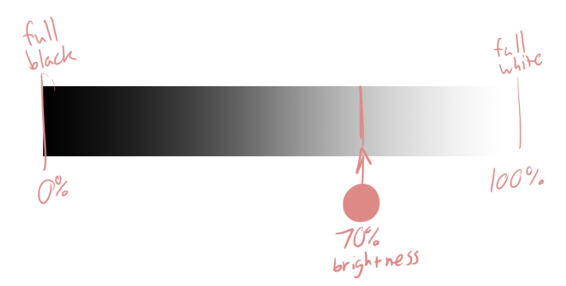
Now, let's say I want the "shadow" (just a hypothetical for now) to be like, 50% of the full light possible.
A common mistake would be to pick a color that's at 50% brightness. However, base colors have their own independent brightness too!!
The solution is to pick 50% of the BASE COLOR'S VALUE. NOT THE TOTAL VALUE!
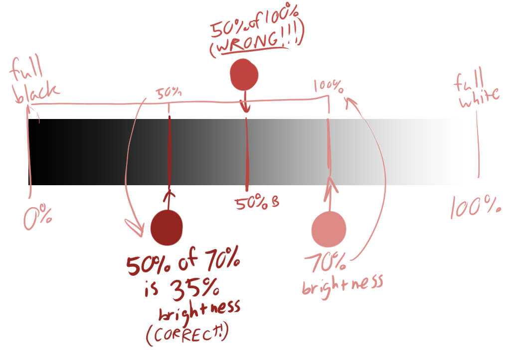
Now we have a system that lets us pick the correct shadow colors every time. Let's say in the same scene, this object has dark green and light blue patterns:
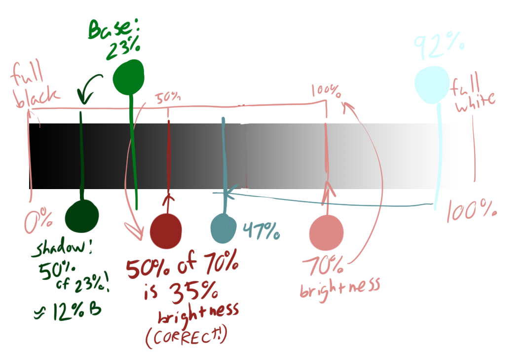
And let's put these all together as a test:
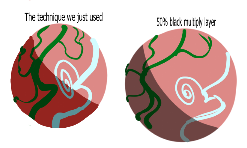
Looks pretty cohesive right? The benefit of manually color picking like this is that while it retains the same value relationships (look at the green especially!), we have more artistic freedom to pick vibrant and interesting colors (like the reds and blues!), rather than handing it off to a nonhuman algorithm.
This applies to multiple value gamuts. Mainly we'll be using the full range of values, but you can set the total "100%" or "0%" wherever you want for different looks.
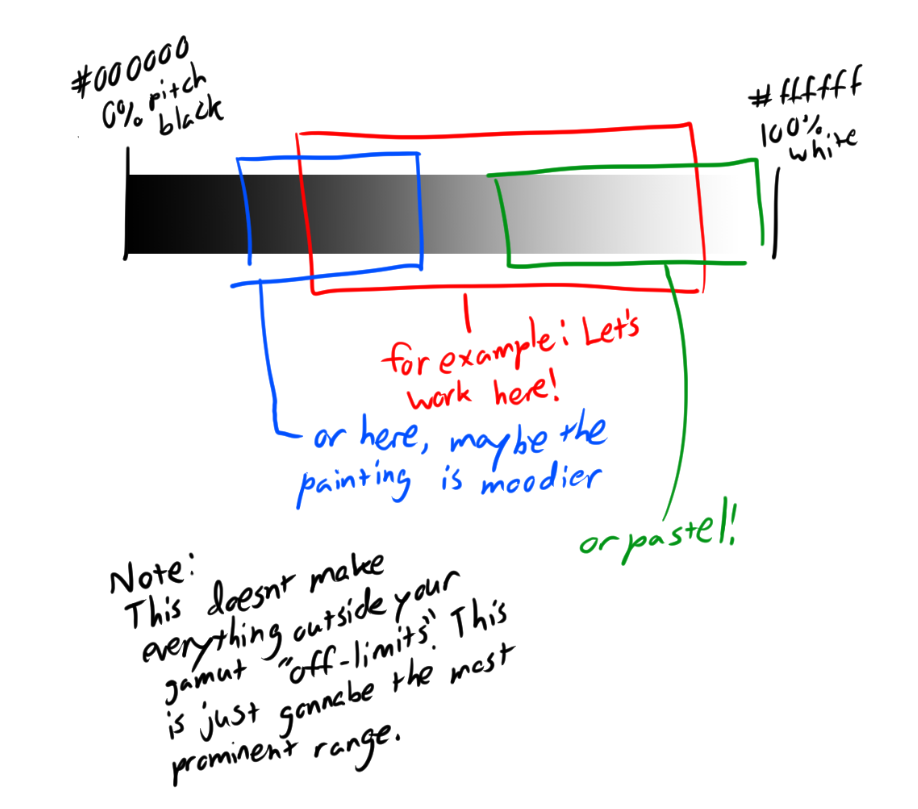
Anyways, that's all.
PROTIP: THE HUMAN EYE IS MORE SENSITIVE TO VALUE THAN COLOR. FOCUS ON GETTING THE VALUE RELATIONSHIPS RIGHT, THEN FOCUS ON COLOR. The color makes it look pretty, the value makes it look real.
Using what we just learned, let's make a pallette for the hand. This is just the hand skin, with a hint of blush for effect.
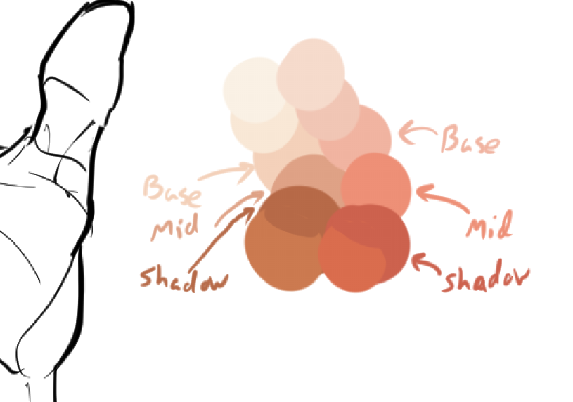
This should cover most of what I need to shade this hand.
Now, we want to Block out the main colors.
To do this, we need to split the drawing into 3 regions: the Shadows, Midtones, and Highlights. I've already marked the colors we'll use for those in the pic above.
Now for the question, "where do I put those values?"
There are 3 things that affect how much *direct* light hits a surface:
- The Surface Angle from the light. If the surface is facing more than 90 degrees away from the light, it'll receive *none* of it directly.
If a surface is directly facing the light, it'll recieve *as much as it can* based on the other 2 factors...
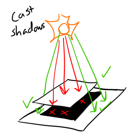
- Cast shadows, aka whether the surface is overlapped by another surface, such that light rays are occluded. This will cause *no* direct light to reach the surface.
- Distance. Light falls off quadratically, so the amount of light a surface recieves is reduced by its distance from the light.
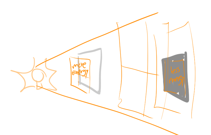
- We won't really be using this for the hand, since it's a relatively small object with a nearby light source. This rule is most helpful for landscape art and larger scenes.
Using these principles, let's block out the hand values one-by-one, using our shadows, midtones, and highlights.
Surface angle block-out: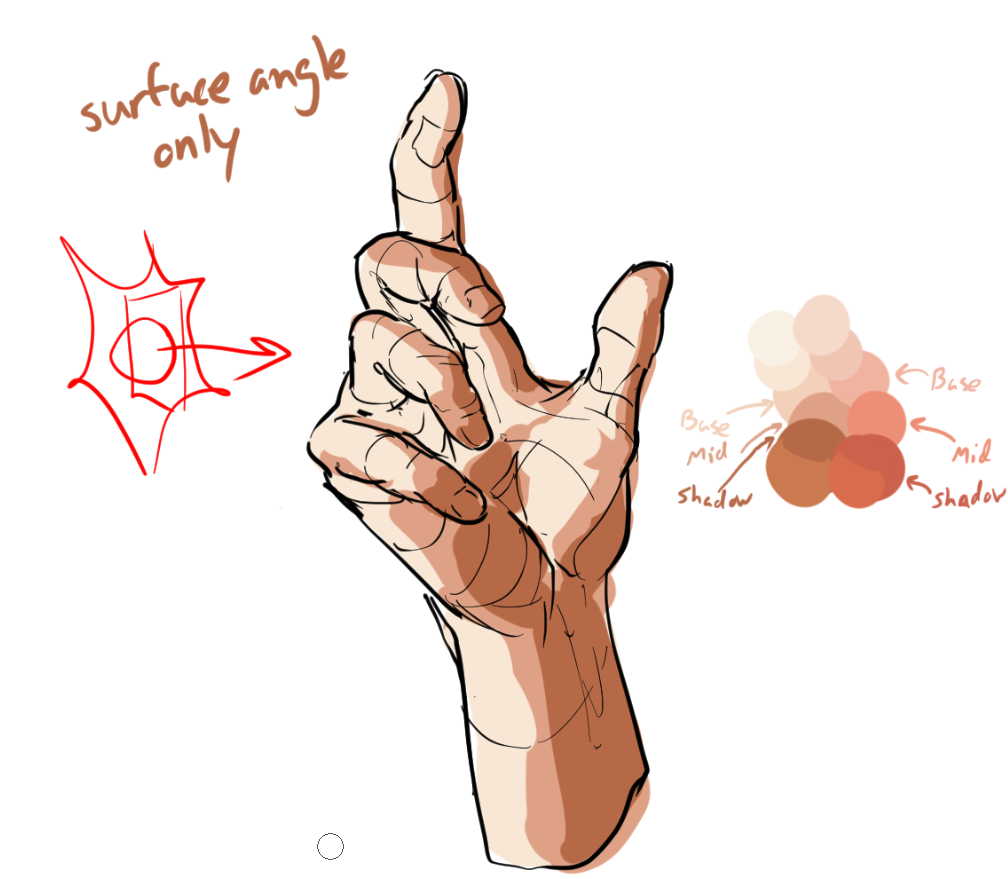
Here, I only shaded the values based on their angle from the light source. The faces more than ~90deg from the light are shaded with the shadow color, the faces toward the light are shaded w/ the base color, and the faces halfway between are shaded with midtones.
THIS IS WHY I SAID IT'S IMPORTANT TO KNOW YOUR FORMS!!! Knowing the angle of the surface vs. the light is absolutely essential to getting better at this step. In addition to the next one:
Cast shadow block-out: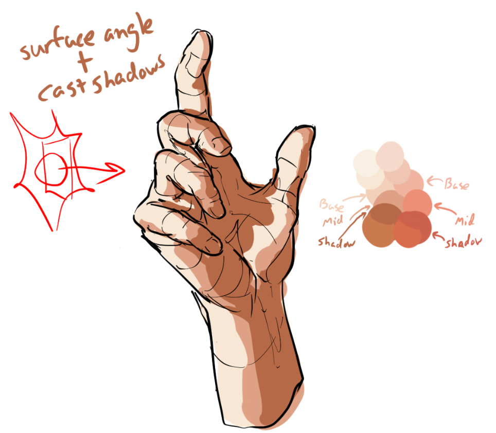
It's not too much, but now the fingers cast a shadow on the palm and themselves. Notice that I'm using hard shadows for the cast shadows. This is because the light source and subject matter are nearby + small.
For larger and farther lights, the cast shadow tends to get blurrier. The cast shadow also blurs out the farther it is from the subject. Because the subject is small, there's not much of a chance for that to happen.
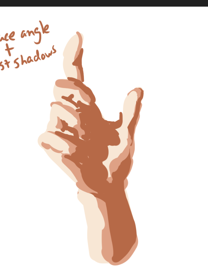
Here's what the blockout looks like with the line layer hidden. It looks pretty sloppy (this is fine, it's just a blockout), and the lighting is okay-ish, but it also looks a bit flat still... This is because we haven't yet added ambient/reflective lights, speculars, or ambient occlusion.
The big 3: Ambient/reflective lights, speculars, and ambient occlusion... are actually all the same. Kinda.
For those not in the know:
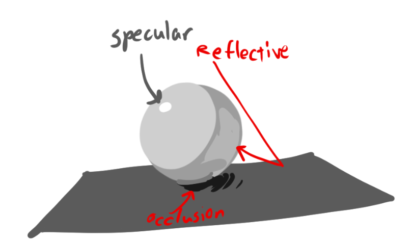
- Ambient/reflective light is the light that bounces from one surface to the subject (the "bright" part of a shadow?).
- Speculars are the little bright spots on shiny objects (the part with the most light?)
- Ambient occlusion is the part of a shadow that recieves little to no light (contact shadows?)
Well, not really. That's all kind of wrong.
Are you ready to have the biggest brain blast of your life?
Ambient light, Reflected light, Speculars, are all the same thing. They're ALL reflections. Just blurry.
"Ambient occlusion" is just a lack of those reflections.
Don't believe me? Just watch as I change the roughness of this ball:
Speculars are *NOT* the part of an object where the most light hits. They are a reflection of the light source reaching your eyes. Notice how the specular here reaches a donut shape, just like the light.
Ambient/reflective lights are the object's blurry reflection of the environment, blurriness depending on how rough it is. Notice the floor's checkerboard pattern forming as the smoothness increases.
Ambient occlusion is just the part of an object that doesn't recieve as many reflections. This isn't strictly limited to contact shadows, but rather any area in which the direct light source can't easily reflect to. For example, a cardboard box with only one side open and a light behind it would have lots of ambient occlusion inside it, because it would be harder for the light to get in.
Why is this helpful?
Because this means we can figure out and think about the ambient occlusion, reflective lights, ambient lights, and speculars ALL AT ONCE. They are simply reflections of the world around the subject. There's no need to separate them.
It sounds daunting, but I'll show you how I go about this.
Alright, let's start adding some depth to this hand.
First, I'll paint the reflections of the hand's skin onto itself. I already chose this color in my pallette, so painting it on is pretty easy.
The key is to choose points at which the surface of the hand faces other surfaces, or potentially parts of the disembodied body (which I did to the bottom of the palm for that effect.)
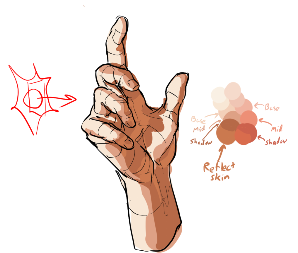
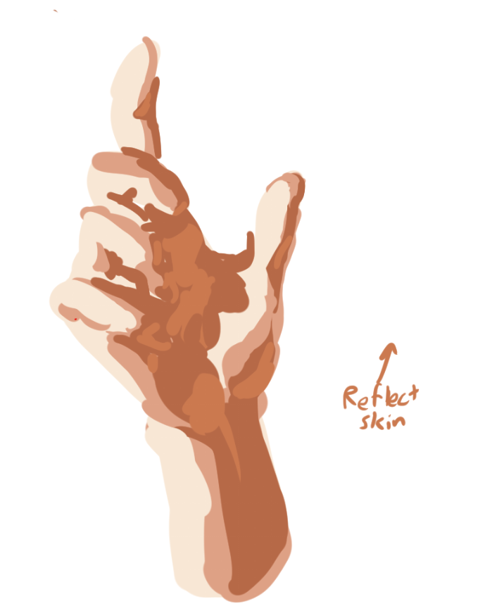
If we look at the lineless version, it already has a lot more 3-dimensionality! We're not done yet though, muahahahahaha..
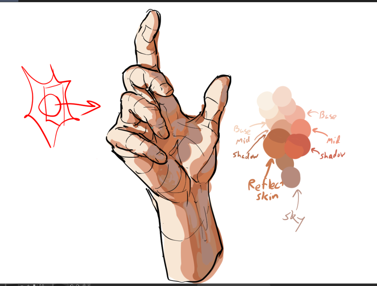
Remember when I said I'd be drawing this at daytime? Now's when I put this to action and add a blueish tinge for parts of the shadow that face the sky. It may look a LITTLE out of place now, but it'll really be tied together soon, trust me.
Now we can add the specular reflections. Skin has a kind of shiny outer layer which makes these more prominent, so it won't be hard.
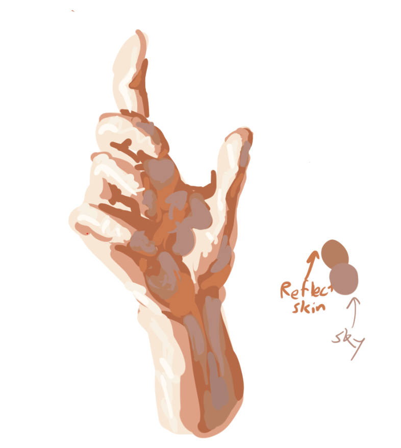
It DOES look kind of weird and shiny, but that's mostly just how I block these out since I plan on blending and dulling them later. Having these splotches of specular color helps with creating a texture later on.
Now to get a little darker, let's add some occlusion shadows, so the hand is more distinguishable without lineart:
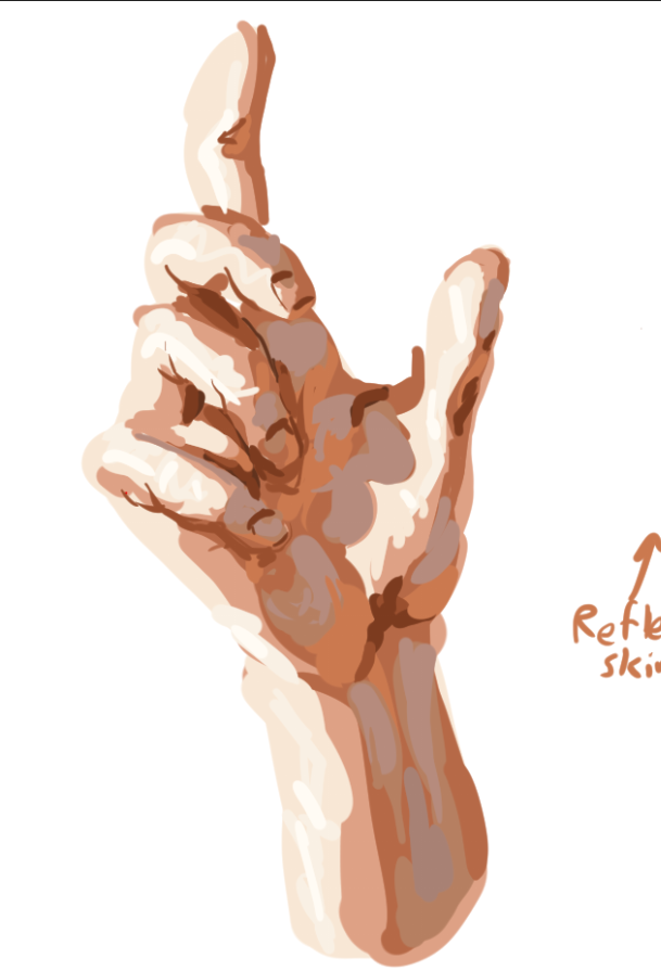
There, now we can actually see the fingers w/o lineart lol. Now, this hand is still a bit sloppy (since it's just a blockout), time to clean it up!
I think the easiest way to do this is to just erase and draw on this more to better fit the sketch.
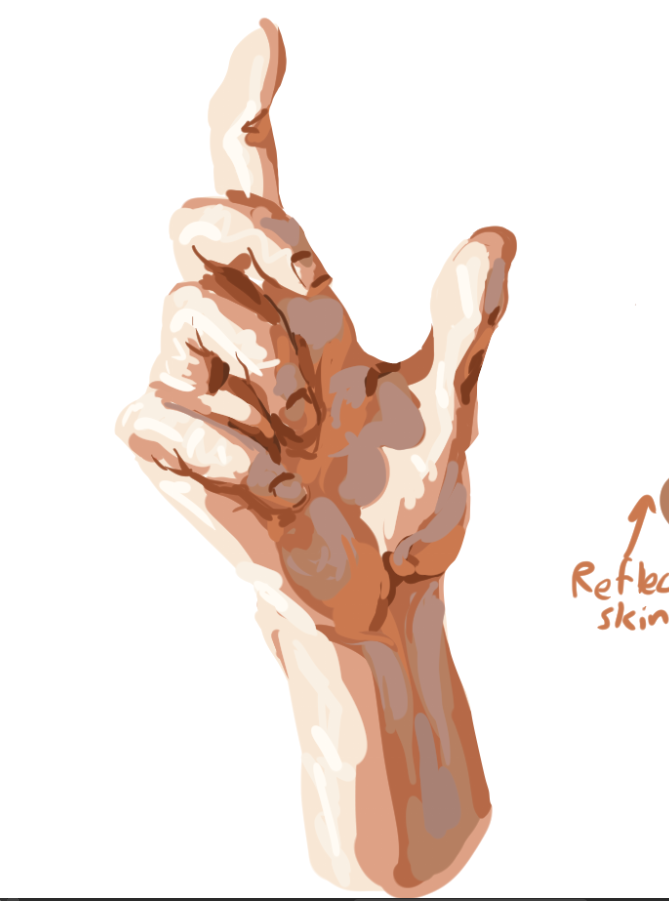
Now lets blend it! There are a lot of ways to do this, but I'll just use a thick oil paint brush, since I kind of want a more textured feel.

A lot of this rests on practice and knowing what looks good so feel free to experiment. The rule of thumb is that curved surfaces should be blended, sharp corners should be left alone. Think of it like sculpting.
Here's my process:
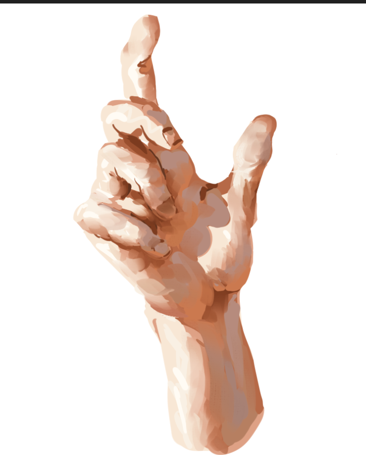
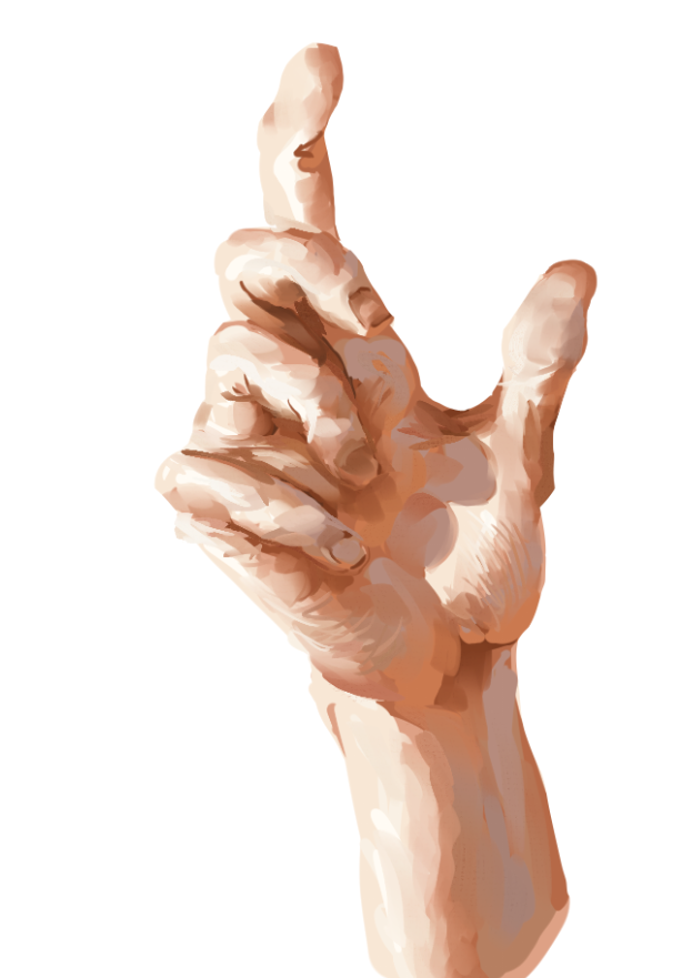
And here's the end result! It's pretty rough since I was trying to speed through this at 5am, but I think it looks pretty good and hand-like.
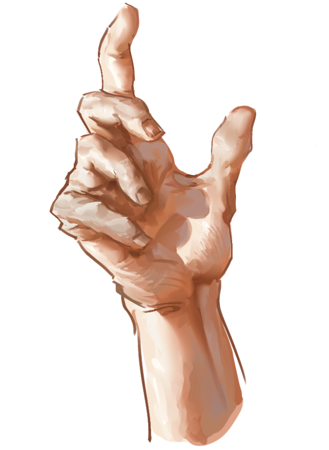
This was drawn and painted entirely from imagination without reference. Mainly to prove that it's possible to get a decent semblance of reality without needing to refer to a photo or anything.
However, using references can make your paintings even more realistic, and I highly recommend doing so.
Extra painting tipz and trickz
- Use RGB sliders! it makes color modifications and mixing way easier!
- Feel free to experiment with drawing on top of your paintings (like i did in the demo.) It's fun and a great way to add 2D appeal to a painting.
- Experiment with painting by just laying down some color blobs without sketching, and try rendering them!
- Use 3D software like Blender Cycles to make sure your lighting is correct while practicing painting! It's surprisingly versatile.
- When blocking in, group your blocks together into larger blobs. Getting too detailed during the block-in phase misses the point of blocking in.
- Use shape design! Try opting for flowy, obtuse shapes rather than disjoint, acute shapes. However the latter can provide a complement to the former.
- Look at cool paintings online! Don't be intimidated, try copying them! You'll learn a lot!
- Including at least 3 hues in a light-dark transition looks hella cool!
- When painting speculars on cylinders or oblong curved shapes, keep most of the specular focused to one area and blend its edges out along the direction of the form.
- Hatching with your brush and doing other cool brushstrokes looks cool and can really tie a painting together!
- Try using a colorful background when painting something, it can really tie things together and help you pick better colors.
- Always save detail for after simplification!
- Build a visual library! Movies, games, comics, tv shows, manga, go traveling, touch grass, whatever! The more cool art with high artistic value you consume, the more concepts and designs you'll have at your arsenal.
- Try challenging yourself! For example, draw only on 1 layer and don't undo or erase. Just paint over your mistakes.
- Don't forget to practice drawing!
- Realistic colors look good, but so do pretty colors. Don't be afraid to push the saturation or color contrast of your paintings! Give red things blue highlights! It's cool!
- Try making more abstract works! You don't have to only draw realistic things, laying down shapes and colors to depict your emotions and whatnot can also really help you improve artistically and find the kinds of themes or designs you like to explore!
- Try applying this knowledge to cel shading! It works pretty well, but with some constraints!